Pages

Friday, January 31, 2014

Zoya Bevin

Bevin was released by Zoya as part of its True collection for spring 2012. According to the riff writers at Zoya, Bevin is a "a dusty, medium sage green with teal tones." I'm not sure what to make of that characterization but my first reaction is that it's a little more complicated than it needs to be. Bevin is basically just a medium-light muted green-leaning turquoise with cool grey overtones, a very pretty and flattering color.

Application was pretty good. The consistency is fluid and dense with a tendency to pool. This is basically a desaturated or whitened color and so has a few of the application hazards of a pastel, though not as severe. It's not an outstanding self-leveller and will settle into ridges and it can pull patches if applied over itself when wet. Pigmentation was very good, though, with complete opacity in two coats. This polish is best applied with a thin first coat that's allowed a few minutes to to set before following with a medium to medium-thick second coat. Bevin dries naturally in good to average time to a smooth shiny finish.

Photos show two coats of Bevin over Seche Rebuild treatment and Butter London Nail Foundation basecoat with a topcoat of HK Girl.


Zoya Bevin


Zoya Bevin


Zoya Bevin


Zoya Bevin


Zoya Bevin


Zoya Bevin


Zoya Bevin


Zoya Bevin


Zoya Bevin


Zoya Bevin


Zoya Bevin


Zoya Bevin


Zoya Bevin


Zoya Bevin

I coveted this polish from the first swatches I saw of it online and it's been a long while waiting for the right opportunity to acquire it. Victory is SWEET! I love this is soft smooth laid-back color. Though a touch greyer and less saturated, it reminds me very much of my favorite turquoise from the Kingman Mine in Arizona, which is known for it's blue-green to green color and polishes out beautifully to a dusky creamy blue-green. 

Kingman Mine Turquoise, small polished nuggets

It also reminds me a lot of Misa Dirty Sexy Money. For an excellent comparison of Bevin with similar blue-leaning turquoise greens, Spaz & Squee did a fabulous post here showing Bevin against OPI Mermaid's Tears, Essie Greenport (lemming, hello!) and Misa Dirty Sexy Money. Of the group, Bevin has the duskiest look.

I had it on today while running errands and discovered after I'd left the house that it was matchy matchy with the top I was wearing under my flannel shirt. I never try to match polishes with clothing so this was a rare happening in my career as a polish enthusiast. Do you try to match your polish and outfit choices? What's your method of pairing polishes with clothing? Inquiring minds want to know!

love,
Liz

Thursday, January 30, 2014

Zoya Rikki

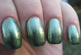
Rikki was released by Zoya as part of its Irresistible collection this past summer. Zoya describes it as a fern green foil metallic and I agree. It's a light washed grassy metallic green with golden shimmers and Zoya's beautiful scintillating foil finish.

Application was wonderful. The consistency is fluid and light, lays down in thin coats and is easily controlled. Rikki stays wet on the nail when applying and so is amenable to being fussed with, not that you'll need to. Pigmentation is excellent with completely opaque coverage in two coats. I used three because I had a nick in one nail and frankly, it was just that easy to do. This is one of those polishes where shimmery bits disperse immediately over the skin during clean up but they are fairly easy to sweep up. Rikki dries in very good time to a smooth shiny finish.

Photos show three coats of Rikki over treatment and basecoat with a topcoat of Glisten & Glow HK Girl.


Zoya Rikki


Zoya Rikki


Zoya Rikki


Zoya Rikki


Zoya Rikki


Zoya Rikki


Zoya Rikki


Zoya Rikki


Zoya Rikki


Zoya Rikki


Zoya Rikki


Zoya Rikki


Zoya Rikki


Zoya Rikki

The Irresistible collection is entirely made up of polishes with this beautiful foil finish that Zoya does so well and while I would love to have them all, Rikki was one of the polishes I wanted most. I wasn't able to acquire it until recently but it was worth the wait. I love the color and in this finish it is gorgeous.

love,
Liz

Wednesday, January 29, 2014

Butter London Come to Bed Red

I'm not entirely certain but I believe Come to Bed Red was released by Butter London as part of its fall collection for 2010. I hope someone will correct me on that if it's inaccurate. In any case, its been part of the Butter London core line for a while now. I got mine on ebay, of course, during one of my episodic attempts to attain a different Butter London red, Knees Up. I'm still waiting for opportunity and circumstance to catch up with that one, but I did win Come to Bed Red. Got it, put it away, forgot about it. Ignominy! 

I rediscovered it while rooting around in my Butter London stash for untrieds. There it was, this beautiful red, cozied by its compadres but utterly unloved by me. Into the swatching chute it went and now I can rectify my heretofore unkind treatment of this fabulous lacquer.

Come to Bed Red is a medium-dark crimson red creme/jelly hybrid. It's cool-toned and deeper compared to Butter London's Pillar Box Red, although you can't tell it very well from looking at  photos. Pillar Box Red is flatter and brighter, and it's a touch harsh against my pinkage in person. Come to Bed Red suits my complexion better, and there's a touch of the jelly composition's translucence to it that gives it a luminous quality, very beautiful and becoming of the color.

Application was fairly easy. The consistency is fluid and light but non-flooding and easy to control. This is one of those polishes that begins to dry on the nail as you're applying it, so quickness and accuracy are helpful to a gratifying application experience. My dominant hand has no problem with this by now, but my non-dominant, my left, lags behind (alas!) and created a bit of unevenness on the nails of my right hand. Otherwise, I probably wouldn't have needed a second coat -- Come to Bed Red is that well pigmented! Clean up was a snap with my new clean up brush *beam* and Come to Bed Red very agreeably did not leave staining on swiped areas as red polishes sometimes do. It dries naturally in good time to a beautiful glossy finish.

Photos show two coats of Come to Bed Red over treatment and basecoat with a topcoat of Glisten & Glow HK Girl to even things out further on my right hand and protect against the malevolent forces. I have only good things to say about this topcoat, btw. Its film-forming and dry time seems equal to Seche Vite and Poshe and its consistency is more fluid and less sticky.


Butter London Come to Bed Red


Butter London Come to Bed Red


Butter London Come to Bed Red


Butter London Come to Bed Red


Butter London Come to Bed Red


Butter London Come to Bed Red


Butter London Come to Bed Red


Butter London Come to Bed Red


Butter London Come to Bed Red


Butter London Come to Bed Red


Butter London Come to Bed Red


Butter London Come to Bed Red


Butter London Come to Bed Red


Butter London Come to Bed Red

In person, Come to Bed Red is deeper and more nuanced than most of these photos show, a medium-dark tone and more of a vivid than a bright color. The last photo is the most accurate. It reminds me a lot of Deborah Lippmann's My Old Flame, which is currently tied for my favorite red with Zoya America. I guess now it's a three-way tie, because I am loving Come to Bed Red!

Do you have a favorite red creme or creme/jelly hybrid? Do you have a preference between warm and cool when it comes to red?

love,
Liz

Tuesday, January 28, 2014

Pretty Serious Elliot and Shimmer Polish Julie

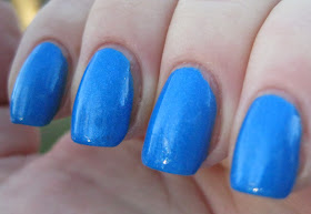
Today's Pretty Serious polish is Elliot, released as was yesterday's polish, Claris, as one six polishes in Pretty Serious' In The Night collection. Elliot is the boy character in the Nights Into Dreams Sega Saturn game upon which the collection is based. Elliot, the polish, is a medium saturated bright azure blue with silvery shimmers that are shy at first but become more affable as you get to know them.

Application was lovely. Elliot's consistency is fluid, creamy and light and lays down evenly over the nail. This is a well pigmented polish with complete opacity achieved in two coats. Elliot dries naturally in average time to a smooth shiny finish. A good topcoat adds luminosity to the color, which I think makes it even more beautiful.

As an aside, I got a new clean up brush. Some time ago I read something somebody somewhere had written about the ELF Essential Concealer Brush and how it was great for manicure clean up. I'd been using a small angled eyeliner brush for clean up and while adequate it was a little stiff and straight for the cuticle area especially and over time had started to splay as well. So I ordered the ELF brush. With a filbert-shaped tapered rounded edge and more flexible bristles than my old brush, it makes clean up a lot more fun. I like it very much!

Back to the polish! Photos show two coats of Elliot over treatment and basecoat with a topcoat of Glisten & Glow HK Girl. Despite oils and lotions, my fingers are still flaky. My apologies.


Pretty Serious Elliot


Pretty Serious Elliot


Pretty Serious Elliot, plus bonus bathrobe lint!


ditto


Pretty Serious Elliot


Pretty Serious Elliot


Pretty Serious Elliot


Pretty Serious Elliot


Pretty Serious Elliot


Pretty Serious Elliot


Pretty Serious Elliot


Pretty Serious Elliot


Pretty Serious Elliot


Pretty Serious Elliot


Pretty Serious Elliot

This lovely dense limpid blue reminds me of the sky on a clear day when the air is washed and clean and the humidity is low. Stare straight up and gradations of pure azure are what you'll see. 

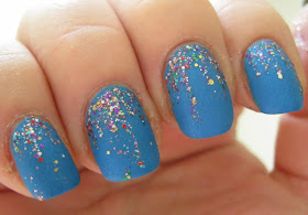
To play with Elliot a little, I added a quick dabbed glitter gradient with Shimmer Polish Julie, a melange of mixed glitters with a general emphasis on purple, blue, cyan and gold, and matted it with OPI Matte Topcoat.

Shimmer Polish Julie over Pretty Serious Elliot with matte topcoat

Shimmer Polish Julie over Pretty Serious Elliot with matte topcoat


Shimmer Polish Julie, macro shot in the bottle


Shimmer Polish Julie over Pretty Serious Elliot with matte topcoat


Shimmer Polish Julie over Pretty Serious Elliot with matte topcoat


Shimmer Polish Julie over Pretty Serious Elliot with matte topcoat


Shimmer Polish Julie over Pretty Serious Elliot with matte topcoat


Shimmer Polish Julie over Pretty Serious Elliot with matte topcoat


Shimmer Polish Julie over Pretty Serious Elliot with matte topcoat


Shimmer Polish Julie over Pretty Serious Elliot with matte topcoat

Elliot is lovely matted -- it looks even more like a clear sky than it did glossy -- and the fabulous mixed colors of Shimmer Julie are a party over Elliot's azure blue.

With this manicure as my "brave pill," I think I am ready to write the check to my lawyer to take care of that speeding ticket I got on Rt. 86! 

love,
Liz