Pages

Monday, August 31, 2015

Emily de Molly Gilded Grove

Gilded Grove was released by Australian indie polish maker Emily de Molly in early May this year. Described by creator Hayley as a "British racing green with copper to gold flakies," I'd say that this is more of a medium-toned forest green creme/jelly hybrid bearing ultrachrome flakies with a copper to gold color-shift. The color feels unusual for a nail polish green, earthy and rich with a soft, washed feeling like a favorite flannel shirt, and very evenly balanced on the blue/yellow, cool/warm spectrum. The variably-shaped and sized ultrachrome flakies gleam brightly in the translucent crelly formula in shades of green and blue in addition to copper and gold. With it's shamrocky green base and golden treasure flakies, this would make a perfect St Patrick's Day polish!

Application was great! The consistency of Gilded Grove is fluid, light and smooth, with a silky, self-leveling glide over the nails. The flakies are very well-behaved, go on smoothly and lie flat to the nail without tumbling, stickups or protrusions over the free edge. With the polish's built-in translucence, coverage is buildable over multiple coats. I used three for this manicure and even though I can still detect a hint of visible nail line when backlit, it is wearably opaque under most viewing circumstances and the color is rich and full. Cleanup is easy and straightforward with almost no pigment travel and just a hint of residual staining, mostly at the cuticle. Gilded Grove dries naturally in very good time to a beautiful glossy finish with no detectable texture from the components.

Photos show three coats of Gilded Grove over treatment and basecoat with a topcoat of Seche Vite.
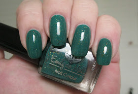

Emily de Molly Gilded Grove


Emily de Molly Gilded Grove


Emily de Molly Gilded Grove


Emily de Molly Gilded Grove


Emily de Molly Gilded Grove


Emily de Molly Gilded Grove


Emily de Molly Gilded Grove


Emily de Molly Gilded Grove


Emily de Molly Gilded Grove


Emily de Molly Gilded Grove


Emily de Molly Gilded Grove


Emily de Molly Gilded Grove


Emily de Molly Gilded Grove


Emily de Molly Gilded Grove

In retrospect, I probably should have added an additional coat for the photos to minimize sheerness at some of my nail tips and to give a better overall representation of what this polish is like in person, where the slight translucence that you see in some of these photos is not noticeable. The color, though, has translated accurately: a nice forest/pine green, mellow and organic, one that I'm sure green polish lovers especially can appreciate.

If you're into indie polishes, you've probably read about the Mentality Polish debacle that has recently received a lot of attention from polish enthusiasts, bloggers and folks that monitor independently made beauty products. Certain products from Mentality have been linked to onycholysis, a condition where the nail separates from the nail bed, with accompanying pain, sensitivity and swelling. Mentality's reproachable handling of this problem has resulted in a maelstrom of criticism and recrimination. You can find more detailed information in these posts: Mistakes Happen but This Response is Unacceptable by Kirby of The Mercurial Magpie, Fact Check: What's to Blame for Mentality Nail Polish Problems by Michelle of Lab Muffin and Thoughts from a [former] Mentality Blogger by Kelly of Nails for the Sake of Sanity.

I have featured Mentality here a dozen times over the last couple of years. While I've not had any symptoms from my most recent Mentality purchase in May this year, which from what I understand would have been the most likely polish to cause them, I do feel like I dodged a bullet. Needless to say, I won't be purchasing from them again. In fact, after all that's happened and continues to happen, I'll be very surprised if Mentality survives this catastrophe.

Although shocked and deeply disappointed by these circumstances and Mentality's handling of them, I believe absolutely that this situation is a singular anomaly in the world of indie polish making. I've purchased and used hundreds of other independently made polishes over the past four years with zero problems and will continue to do so. My enthusiasm is undimmed, my support ongoing. 


love,
Liz

Saturday, August 29, 2015

Emily de Molly Ariel's Realm

Ariel's Realm was released by Australian indie polish maker Emily de Molly as part of the Back to Base trio in December 2014. Hayley, the owner and creative force behind this brilliant Aussie brand, recently did all of us in the US a solid by opening an online storefront here, so you know I beat a path to that door forthwith and purchased three polishes, of which Ariel's Realm is one. It's been almost two years now since I featured my hitherto one and only Emily de Molly lacquer, Studded Jeans, and I'm thrilled to have a direct source for her offerings.

Ariel's Realm is a very deep cerulean blue jelly bearing superabundant ultrachrome flakies in shifting colors of blue, green and gold as well as tiny ultraholo microglitters in copper. The deep blue-green jelly base is pigmented enough to provide wearable coverage in two coats and translucent enough to allow the tiny variably-shaped flakies to gleam brilliantly from within. Add a generous sprinkling of ultraholo microglitters and you have a marvelous pavé of darkly-bedded jewel-tones flickering with perfect panache on your nails. Stunning!

Application was wonderful. The consistency of Ariel's Realm is fluid, light and smooth with a silky, self-leveling slip over the nails. No stickiness, no running or pooling, no tumbling or stickups or protrusions, just pure nail-painting bliss. Being a jelly, coverage is buildable. If you want a brighter base color then two coats will accommodate you perfectly. I acquired two unusually large flakies on one nail with my second coat, which my OCD tendencies would not allow to stand so I added a third coat to that nail. Seeing that it darkened the base substantially enough to look different from the others, I added a third to them too. The deeper the base color, the more dramatically the flakie and ultraholo microglitter colors pop from within it. Cleanup is easy and straightforward with surprisingly little pigment travel and no residual staining, hooray! Ariel's Realm dries naturally in very good time to a mostly smooth, shiny finish with a tiny bit of texture, more visual than tactile, from the components. Topcoat glosses things up and further accentuates all the colorful bits.

Photos show three coats of Ariel's Realm over Pretty Serious Rock On treatment and Pretty Serious All Your Base basecoat with a topcoat of Seche Vite. The washed-out halos near my cuticles on some fingers mark places where topcoat fell short of the polish -- my bad!


Emily de Molly Ariel's Realm


Emily de Molly Ariel's Realm


Emily de Molly Ariel's Realm


Emily de Molly Ariel's Realm


Emily de Molly Ariel's Realm


Emily de Molly Ariel's Realm


Emily de Molly Ariel's Realm


Emily de Molly Ariel's Realm


Emily de Molly Ariel's Realm


Emily de Molly Ariel's Realm


Emily de Molly Ariel's Realm


Emily de Molly Ariel's Realm


Emily de Molly Ariel's Realm


Emily de Molly Ariel's Realm

My photos do not do proper justice to this marvelous creation. In person, the colors are brighter and the components stand out more, and although the base is indeed very dark at three coats, it is not as quite as murky as it appears here. If you would like to see the color at two coats, I recommend taking a look at Alena's gorgeous review photos of this polish on her blog, The Polishing Life. She captures the lively colors of the components and the teal-leaning cerulean blue of the base with much more accuracy than I have.

I would love to get my greedy grasping paws on Calibrated, the purple sister to Ariel's Realm, but it's not offered at Hayley's US storefront... yet! Hope springs eternal!

love,
Liz

Friday, August 28, 2015

Pahlish The Dawn Patrol

The Dawn Patrol was released last month by Arkansas-based indie polish maker Pahlish as part of the Jungle Book Trio, a mini collection inspired by the 1967 Disney animated film The Jungle Book. I was six when this film came out and saw it in the theater with my family. My parents subsequently purchased the musical soundtrack for us, which we played to death, learning the words to all the songs. I believe we still have that album somewhere in the garage. Apparently Shannon got some of the songs stuck in her head, leading to the creation of the trio. I can totally relate to a Jungle Book earworm!

The Dawn Patrol is a sumptuous medium teal holographic polish with foresty undertones bearing abundant particulate shimmers in gold. The holo pigment seems to be of a medium mill, with a more scattered than linear effect, but it generates a gorgeous dimensional depth in the color with beautiful on-tone shading in indirect light and bright sparks of blues and greens in direct sun. The gold shimmers are a lovely addition, suffusing the rich teal with tiny gleaming golden particles and giving it an ephemeral gold flash in certain circumstances, both of which contribute noticeably to the luxurious look of the polish on the nail.  

Application was very nice. The consistency of The Dawn Patrol is fluid, light and smooth with an easy flow over the nail. This polish thickens rather quickly in contact with air and loses some of its self-leveling properties as it sets up, so avoid dawdling and overstroking for the most pleasant experience. Close the bottle and give it a quick shake every now and then to keep the brush from becoming gummy. Pigmentation is very good with wearable coverage in two medium coats, or even better, three thin ones for richest color and most even opacity. Cleanup is fairly easy, with minimal pigment travel, but as with many deeper blues and greens, this one will leave faint residual staining to cuticles especially. The Dawn Patrol dries naturally in very good time to a smooth, flat finish that wants a nice topcoat to look its best.

Photos show three coats of The Dawn Patrol over treatment and basecoat with a topcoat of Seche Vite.


Pahlish The Dawn Patrol


Pahlish The Dawn Patrol


Pahlish The Dawn Patrol


Pahlish The Dawn Patrol


Pahlish The Dawn Patrol


Pahlish The Dawn Patrol


Pahlish The Dawn Patrol


Pahlish The Dawn Patrol


Pahlish The Dawn Patrol


Pahlish The Dawn Patrol


Pahlish The Dawn Patrol


Pahlish The Dawn Patrol


Pahlish The Dawn Patrol


Pahlish The Dawn Patrol

Shannon excels at creating strong, rich tones such as this with her holographic polishes. The Dawn Patrol has that Neo-Impressionist Pointillism thing going on, where the polish appears to be made up of bazillions of tiny dots, each a slightly different color. It's one of the most delicious and dimensional of any holographic effect, in my opinion, along with color nuancing. As much as I admire a delineated prismatic display, my heart belongs to scattered holos like The Dawn Patrol.

If you've never seen The Jungle Book movie and are curious about the earworm that led to the creation of this polish, you can listen and watch here. My significant other, the military historian, claims it is particularly British in heritage. All I know is that for a short little song, it sure leaves a big footprint. 

love,
Liz

Thursday, August 27, 2015

Smitten Polish Aer Opal

Aer Opal was released by Missouri-based indie polish maker Smitten Polish as part of the Opalescent Elements collection in May this year. This is the last of my Opalescent Elements purchases. You've already seen Ignis Opal and Aqua Opal, but I think Aer Opal may be my favorite of the three. 

This is described as a "warm pink-leaning purple filled with iridescent flakies." It's medium slightly milky red-violet color in the bottle but once on the nail it kind of abandons any pretense to purple with an intense rosy lean -- at least on me. The abundant iridescent golden flakies give it a gently dappled appearance and flicker from within the polish in a range of fiery hues from near-red through orange to golden yellow. There's even an occasional flash of bright green! I love the contrast between the gleaming warm tones of the flakies and the cool rosy pink of the base, it gives the polish a burst of delicious chromatic tension that makes my eyes happy. 

Application was great! All three of these Opalescent Elements have eminently paintable, user friendly jelly formulas. The consistency of Aer Opal is fluid, light and smooth with an easy, self-leveling flow over the nail and absolutely none of the stickiness that sometimes characterizes jelly polishes. The flakies are very well-behaved and go on flat to the nail without tumbling, stick ups or protrusions over the free edge. As with all jellies, coverage is buildable over multiple layers. I achieved an opacity and depth of color I was happy with in three coats. Cleanup is easy and straightforward, with a bit of truculence on the part of the flakies. Aer Opal dries naturally in very good time to a shade that's pinker than bottle color and a silky smooth, shiny finish. Topcoat accentuates the multiple colors of the flakies. 

Photos show three coats of Aer Opal over treatment and basecoat with a topcoat of Seche Vite.


Smitten Polish Aer Opal


Smitten Polish Aer Opal


Smitten Polish Aer Opal


Smitten Polish Aer Opal


Smitten Polish Aer Opal


Smitten Polish Aer Opal


Smitten Polish Aer Opal


Smitten Polish Aer Opal


Smitten Polish Aer Opal


Smitten Polish Aer Opal


Smitten Polish Aer Opal


Smitten Polish Aer Opal


Smitten Polish Aer Opal

My initial disappointment that Aer Opal wasn't as purple as I'd hoped lasted only as long as it took me to spot all of the fiery colors generated by the iridescent flakies. They are somewhat shy in my photos, unfortunately, and much more apparent in person. It wasn't until I had this polish on my nails that the whole "opal" part of Opalescent Elements really solidified for me. D'oh! 

I find that the Opalescent Elements polishes take on a whole other life at night under incandescent lighting. The golden flakies release an intense semi-metallic gleam that informs the whole polish. With Aer Opal, some of the purple tones lost in daylight return, making the contrast with the flakies even more intense. Very cool! 

love,
Liz