Pages

Friday, March 31, 2017

Elevation Polish Thousands of Pink Blooms

Thousands of Pink Blooms was released in February this year by Minnesota-based indie polish maker Elevation Polish as part of the Love from Japan collection, a series of five polishes inspired by Japanese gardens and parks. Officially described as a "medium saturated pink, medium to low density holographic," This color is a medium-dark, creamy, magenta-leaning pink with aspects of rose and red-violet. It's kind of like a mixture of red-violet, Pantone pink and telemagenta, and can lean towards any one of the three depending upon the light in which it is viewed. Holographic pigment gives the polish a delicately speckled look with luminous, on-tone dimensional shading and a very fine rosy sparkle in ambient light that develops into an understated prismatic display in the sun.

Application was great! The consistency of Thousands of Pink Blooms is fluid, dense and creamy with a medium viscosity and a plush, full-bodied, self-leveling glide over the nail that went on best for me in medium to generous coats from a well-loaded brush. Pigmentation is very good. A bit of patchiness on the first coat builds easily to evenly opaque coverage with the second. Cleanup is easy. Thousands of Pink Blooms dries naturally in good time to a smooth, shiny finish.

Photos show two coats of Thousands of Pink Blooms over basecoat with a topcoat of Seche Vite.


Elevation Polish Thousands of Pink Blooms


Elevation Polish Thousands of Pink Blooms


Elevation Polish Thousands of Pink Blooms


Elevation Polish Thousands of Pink Blooms


Elevation Polish Thousands of Pink Blooms


Elevation Polish Thousands of Pink Blooms


Elevation Polish Thousands of Pink Blooms


Elevation Polish Thousands of Pink Blooms


Elevation Polish Thousands of Pink Blooms


Elevation Polish Thousands of Pink Blooms


Elevation Polish Thousands of Pink Blooms

This polish reminds me of redbud blossoms, the darker, rosy-purpley ones, which have been blooming around here like mad for the past couple of weeks. I adore this color! It's a beautiful, rich shade with all the spirited, feminine qualities of red-violet that I love, and is especially complementary with lavenders, purples, blues and indigos. 

love,
Liz

Thursday, March 30, 2017

Femme Fatale Sea Glimmer

Sea Glimmer was created by Sophie of Australian indie polish maker Femme Fatale Cosmetics as a Live Love Polish exclusive, released in June 2016. It is described as "a purple polish with iridescent gold shimmer and silver holographic microglitter." A sparkly, ethereal concoction with a transparent base tinted a shade of pigment violet, it's absolutely packed with superabundant ultrafine golden particulate shimmers and two sizes of silvery holographic microglitters, a scintillating, diaphanous look that's like the faerie ballet costume of your imagination. The gold shimmers a create glistening underlay over which the violet base drapes like sheer silk chiffon, revealing a shimmering swath of lemony gold along the axis of light delicately shaded with violet that deepens toward the edges of the nail, the whole densely spangled by bright, twinkling prismatic sparks. 

Application was dreamy. The consistency of Sea Glimmer is fluid, light and smooth with a medium viscosity and a fluent, even slip over the nail that likes to go on in thin coats and is easy to manipulate with Femme Fatale's flattened-style brush. Self-leveling properties are very good and glitter payoff is excellent, dispersing easily and evenly over the nail without undue stacking, stickups or protrusions over the free edge. Coverage is provided by the component mix, dense enough to net wearable opacity in three coats although the polish is so beautiful and goes on so evenly that it could easily be worn as a sheer in one coat. I added a fourth for the photos, but the look did not differ significantly from three. Cleanup is a bear. I did mine as I went along, but even so the glitters, especially, are very sticky and the shimmers disperse to ensconce themselves about the nail environs. Sea Glimmer dries naturally in very good time to a gently textured finish that's not entirely smoothed by topcoat, but given the tremendous lightplay of the components, it doesn't need to be.

Photos show four coats of Sea Glimmer over ÜNT peel-off basecoat with a topcoat of Seche Vite. 

Femme Fatale Sea Glimmer

Femme Fatale Sea Glimmer

Femme Fatale Sea Glimmer

Femme Fatale Sea Glimmer
 
Femme Fatale Sea Glimmer

Femme Fatale Sea Glimmer

Femme Fatale Sea Glimmer

Femme Fatale Sea Glimmer

Femme Fatale Sea Glimmer
 
Femme Fatale Sea Glimmer


Femme Fatale Sea Glimmer


This is not a polish that can easily be captured in a still image and I'm a little dismayed by how my photos turned out. The gold shimmers are more fundamentally golden in person, and the look of the polish sleeker, more coherent and more richly colorful. For another look, check out Hayley's pics in her review on Emily de Molly.

Generally I don't much cotton to extremely sheer polishes, but Sophie's creations are an exception. She is the shimmer whisperer of nail polish makers, and it is almost always worth the time and care to build them to a wearable opacity. Sea Glimmer is a magical polish with a delicate, floaty, otherworldly feel and boatloads of dimensionalizing lightplay, like layers of crystal-studded tulle over shimmering charmeuse. Fantastical!

love,
Liz  

p.s. 

Wednesday, March 29, 2017

Elevation Polish Trollstigen

Trollstigen was released June 2016 by Minnesota-based indie polish maker Elevation Polish as part of the Road Less Traveled collection, a series of six polishes inspired by "roads so epic that they are adventures and destinations all by themselves." 

This polish is officially described as a medium lilac scattered holo with sparse silver microshimmers, and the color appears to be smack dab at the heart of my perpetual confusion over the differences between lilac and lavender. Generally, I think of lilac as more purple, lavender more violet. In other words, there's more red to lilac, more blue to lavender. But Trollstigen appears to straddle the two. It is similar to the lilac from the ISCC-NBS color list, also known as pale lilac, which itself is almost indistinguishable from the lavender of that same list, also known as pale lavender

Six of one, half-dozen of the other? Perhaps. Sources aside, I'm going to call it like I see it: a lightened, creamy variation of floral lavender with a gentle blue cast, more purple than a periwinkle, without a mauve bone in its body. The holographic pigment and silver microshimmers give it a soft, subtle finely-grained visual texture that keeps it airy and dimensional, with occasional tiny sparks of silver or pale azure or pink when light hits it just right and a scattered, minimalist prismatic display in direct sun.

Application inspired a plaintive bit of painting angst. The consistency of Trollstigen is fluid, dense and creamy with a medium viscosity and a smooth glide over the nail, but it had a certain balkiness in terms of going where I wanted it to, as though it would rather stay on the brush than flow onto my nail. Where I would usually would rely on gravity and physics, it turned out to be much more effective just to use the tip of the brush and push it where I wanted it go, especially on the first coat. Whatever! I got it on there! Self-leveling properties are very good and pigmentation, very good to excellent. The opacity at one medium coat is impressive, but two ultimately delivers most even coverage as well as full bottle color. Trollstigen dries naturally in very good time to a smooth, shiny finish. Topcoat does not appear to affect the holographic properties at all. 

Photos show two coats of Trollstigen over basecoat with a topcoat of Seche Vite.


Elevation Polish Trollstigen


Elevation Polish Trollstigen


Elevation Polish Trollstigen


Elevation Polish Trollstigen


Elevation Polish Trollstigen


Elevation Polish Trollstigen


Elevation Polish Trollstigen


Elevation Polish Trollstigen


Elevation Polish Trollstigen


Elevation Polish Trollstigen

Another wonderful spring shade, elegant and soulful and not a pastel. Huzzah! Definitely worth the angsty application pique.

The name Trollstigen, Norwegian for "Troll's Path," comes from a narrow, serpentine section of Norway County Road 63 that winds up a steep mountainside via eleven hairpin turns and crosses the picturesque Stigfossen waterfall. Designated a National Tourist Route, with a museum and viewing platforms at its plateau.

hairpins on the Trollstigen road, Norway

love,
Liz

Tuesday, March 28, 2017

Blush Lacquers Wonder Wheel

I've got another polish from The Road to Polish Con series for you today! Wonder Wheel was created by Victoria of Indiana-based indie polish maker Blush Lacquers for Polish Con April 2017 and released earlier this month from the Polish Con big cartel shop. This one is a bright, clean medium French sky blue bearing a veritable snow shower of flake shimmers twinkling within -- pink, gold and holographic. The pink flakes are especially sparkly and give the polish a transparent pink sheen, more or less prominent depending upon viewing circumstances.

Application was most agreeable! The consistency of Wonder Wheel is fluid, full-bodied and creamy with a medium viscosity and an easy, fluent glide over the nail that sets up fairly quickly but does leave enough of a window for a little finessing. Self-leveling properties are very good as is pigmentation. For most folks, two coats will net evenly opaque coverage. For those with conspicuous nail ridges, like me, three is better at hiding them. Cleanup is easy. Wonder Wheel dries naturally in very good time to a smooth, satiny finish. Topcoat adds a becoming gloss and accentuates the presence of the flake shimmers.

Photos show three coats of Wonder Wheel over treatment and basecoat with a topcoat of Seche Vite. 


Blush Lacquers Wonder Wheel


Blush Lacquers Wonder Wheel


Blush Lacquers Wonder Wheel


Blush Lacquers Wonder Wheel


Blush Lacquers Wonder Wheel


Blush Lacquers Wonder Wheel


Blush Lacquers Wonder Wheel


Blush Lacquers Wonder Wheel


Blush Lacquers Wonder Wheel


Blush Lacquers Wonder Wheel


Blush Lacquers Wonder Wheel

A fresh, invigorating sky blue, perfect for spring! The color is vibrant and fairly saturated but still does an excellent job of showcasing the pretty flake shimmers, which give the look a delicately flecked, twinkly visual texture. Nice!

love,
Liz

Monday, March 27, 2017

Colors by Llarowe A Part of the Big Apple

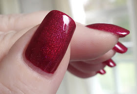
A Part of the Big Apple was created by Leah Ann of Colorado-based indie polish maker Colors by Llarowe for Polish Con April 2017 and released as part of The Road to Polish Con series earlier this month. Described as a deep apple red holo, the color here is a deep, cool-leaning variation of cardinal with aspects of raspberry and mulberry and a softened, plush quality to it that strikes me as very romantic. It is similar in tone to crimson glory or Fresno State cardinal, but abundant ultrafine holographic pigment gives it a rich dimensional radiance that makes it appear as though it is lit from within. The color is saturated enough to swallow more overt prismatic effects, but in the sun you see a glowing, transparent violet heart emanating from a swath of raspberry that is edged with bright red sparks before shading to deep cardinal at the sidewalls of the nail.

Application was primo! The consistency of A Part of the Big Apple is fluid, silky and dense with a medium viscosity and a lush, creamy, self-leveling glide over the nail that is a joy to work with. Pigmentation is excellent, delivering wearably opaque coverage in one medium coat and full bottle color in two. Cleanup is surprisingly easy with a skosh of pigment travel as you might expect but little residual staining. A Part of the Big Apple dries naturally in very good time to a smooth, shiny finish. Topcoat does not alter the holographic effects in any way.

Photos show two coats of A Part of the Big Apple over treatment and basecoat with a topcoat of Seche Vite. 


Colors by Llarowe A Part of the Big Apple


Colors by Llarowe A Part of the Big Apple


Colors by Llarowe A Part of the Big Apple


Colors by Llarowe A Part of the Big Apple


Colors by Llarowe A Part of the Big Apple


Colors by Llarowe A Part of the Big Apple


Colors by Llarowe A Part of the Big Apple


Colors by Llarowe A Part of the Big Apple


Colors by Llarowe A Part of the Big Apple


Colors by Llarowe A Part of the Big Apple

 I love red holos and this one is gorgeous, with a certain demure aspect to the deep, velvety color, a graceful sense of discretion that seems to barely restrain some profound underlying passion. That classic bit of romantic tension is just wildly beautiful and evocative to me. Swoonworthy!

love,
Liz