Showing posts with label Deborah Lippmann. Show all posts

Sunday, April 12, 2015

Deborah Lippmann Spring Buds

Spring Buds was released by Deborah Lippmann as part of the Spring Reveries collection for spring 2014. (Lotsa spring in that sentence!) I loved the swatches of this collection that appeared in polish blogs beginning in January 2014, and still think this is one of the prettiest pastel spring collections I know. Due to my trepidatious relationship with pastels and their infrequent appearance on ebay (where I source almost all of my Deborah Lippmann polishes), I ended up purchasing only one of these polishes -- the green one. But this isn't just any pastel green! It is a neonesque pastel chartreuse, or "pretty playful pistachio," as it's described on DL's website.

This is probably as close as I'll ever get to wearing one of those neon highlighter shades that everyone loves for summer. The combination of a bright yellow green with a base appropriately whitened to pastel stipulations produces a color that looks like it should glow in the dark. At least, on me. It freaked my camera right out, which is why there are only three photos in this review.

Application was both better and worse than I expected. I noticed when reading reviews for Spring Buds that many polish enthusiasts reported great experiences with the formula, achieving smooth, streak-free coverage in only two coats. That wasn't how it went with me. On the other hand, for a pastel with lots of yellow in it, the formula wasn't nearly as problematic as I expected. The consistency of Spring Buds is fluid, creamy and smooth. It isn't difficult to work with as long as you use thinner coats, don't overstroke your application and wait a little bit between coats. Though fairly well pigmented, it was very streaky over my ridged nails, even after the second coat. It self-levels to a point, though, and the third coat, a bit thicker than the first two, pretty much evened things out. What uneven areas were left were completely smoothed with topcoat. Huzzah, Seche Vite! Cleanup was easy and straightforward. Spring Buds dries naturally in good time to a smooth, glossy finish.

Photos show three coats of Spring Buds over treatment and basecoat with a topcoat of Seche Vite. The first is the closest I could get to a normal look with my camera, which flouresced the color beyond redemption, as you will see.


Deborah Lippmann Spring Buds

This is what my camera did with the rest of my takes:


Deborah Lippmann Spring Buds


Deborah Lippmann Spring Buds

These photos remind me of the time I tried to photograph swatches of Butter London's Bossy Boots, except these turned out much better, believe it or not, which is why Bossy Boots never made it to the blog. I desaturated the color in these pics much as I dared (too much, actually), but don't know if it's not my skin tone as much as the camera that makes this pastel look like a neon.

Heaven help me if I ever get my hands on some real neons!

love,
Liz

Friday, September 5, 2014

OPI I Just Can't Copacabana and Deborah Lippmann Glitter and Be Gay

This post is almost unbelievably yappy, even for me. My apologies!

I Just Can't Copacabana was released by OPI as part of the Brazil collection for spring/summer 2014. This polish was received with acclaim when it came out -- I've seen it on at least two blogger "best yellows" lists. It's sunny medium yellow creme with a fresh, clean vibe that's surprisingly easy to wear. I don't wear yellows well but I was actually quite pleased with the way this felt on the nail.

Application was amazing for a yellow, which is a notoriously difficult polish color tending towards streaky, sheer, uneven application and any number of other bad polish behaviors. I Just Can't Copacabana has a fluid, smooth, creamy consistency, a nice balance between fluidity and viscosity and a lovely slip over the nail. It built up beautifully with multiple coats and self-leveled very well. This is one of those polishes that displays darkness where the polish is uneven, and because of my irregular nail beds I ended up applying a third coat to make that go away completely. Someone with a lighter touch and smooth nail beds could definitely achieve smooth even coverage with two. It applied so well that I didn't have much cleanup to do, and what I did have was easy and straightforward. I Just Can't Copacabana dries naturally in average time to a sweet glossy finish.

Photos show three coats of I Just Can't Copacabana over treatment and basecoat with a topcoat of Poshe. Apologies for the fibers sticking to my pinky nail. I honestly didn't even see them until I went to edit the photos, and by that time I'd already layered over this mani with Deborah Lippmann Glitter and Be Gay.


OPI I Just Can't Copacabana


OPI I Just Can't Copacabana


OPI I Just Can't Copacabana


OPI I Just Can't Copacabana


OPI I Just Can't Copacabana


OPI I Just Can't Copacabana


OPI I Just Can't Copacabana

Although I'm unlikely to wear this again by itself, it was kind of a revelation to have it on my nails. So bright and cheerful! Too bad it makes my fingers look like they're decomposing. 

Now we come to the reason that I felt the need to acquire I Just Can't Copacabana in the first place: to serve as a base color for Deborah Lippmann's Glitter and Be Gay! When I featured Glitter and Be Gay here in July, I mentioned having come across a review of it by Polish All the Nails where she layered it over what else but I Just Can't Copacabana. I loved the look of this combination in her photos and made it a mission to replicate it. Let me say at the outset that I don't feel I succeeded. Whether it was because my glitter application lacked finesse (which it definitely does) or my lighting wasn't conducive to capturing attractive photos or both, my manicure isn't nearly as frolicsome and appealing as I'd hoped it would be.

Glitter and Be Gay is a glitter bomb as only Deborah Lippmann can do them. It has a yellow-tinted suspension base absolutely jammed with multiple sizes of hex glitters in yellow, gold, and blue/violet, much of it holographic.

This polish takes some patience to apply. It must be dabbed on (or as I like to say, ploshed and spread). Multitudinous amounts of glitter come out with each brushful and like to stay where they're planted, in clumps. Wiping the brush before application quickly results in a build up of glitters around the neck of the bottle. In short, as I said in my previous post about Glitter and Be Gay, application feels like a hot mess. And yet I still love this glitter!

Photos show one dabbed coat of Glitter and Be Gay over the I Just Can't Copacabana manicure above, with a layer of Gelous to help smooth the considerably textured finish followed by a topcoat of Poshe, which was immediately consumed. I really need to start using another non-fast dry basecoat as my glitter smoother -- Gelous is a bit thin and has an unexpected tendency to block fast-dry topcoats from penetrating all the layers of polish and drying them. At least, that's my best guess as to why glitters smoothed with Gelous sometimes pop off the nail completely within hours of application.


Deborah Lippmann Glitter and Be Gay over OPI I Just Can't Copacabana


Deborah Lippmann Glitter and Be Gay over OPI I Just Can't Copacabana


Deborah Lippmann Glitter and Be Gay over OPI I Just Can't Copacabana


Deborah Lippmann Glitter and Be Gay over OPI I Just Can't Copacabana


Deborah Lippmann Glitter and Be Gay over OPI I Just Can't Copacabana


Deborah Lippmann Glitter and Be Gay over OPI I Just Can't Copacabana


Deborah Lippmann Glitter and Be Gay over OPI I Just Can't Copacabana


Deborah Lippmann Glitter and Be Gay over OPI I Just Can't Copacabana

Like I said, it's not the coherent sparkly yellow colorfest I was hoping for. To me, it's too random, too chaotic and really really busy. Fuzzy was appalled by this manicure: "Look at the clumps!" *lol* In person, this combo is actually much closer to how I wanted it to look than in the photos, but the macro is merciless and unrelentingly thorough. It probably would have turned out better if my application technique was more skilled and my judgment more refined, ie, if I'd used about half as much glitter as I ended up using. But I've had it on for a day now and I have to say, it's growing on me. ;)

I don't have the patience for glitter that I used to, but I still love it, love the sparkle, love the multiple colors, love the random geometry of it. I've got some glitter polishes on their way to me from Hare Polish, my most favorite indie glitter polish maker ever, so perhaps I can regenerate some of my affection for working with this genre of nail polish. Doable, no? Totally. Or as Fuzzy likes to say, either it's all right or it's too bad!

love,
Liz

Friday, August 29, 2014

Deborah Lippmann Waking Up in Vegas

Back in May when I featured Essie Master Plan here on the blog, I lauded it for slaying my Waking Up in Las Vegas lemming based on the look of my swatches and this comparison post by Rachel of stuff I swatched. Well apparently Master Plan didn't actually touch a hair on that lemming's head, because here some three months later I find myself with what else but Waking Up in Las Vegas. I came across it up for auction on ebay and remembered only my desire to possess it and not Rachel's excellent and well-documented advice that if I had one I didn't need the other. Thus are destashable dupes created.

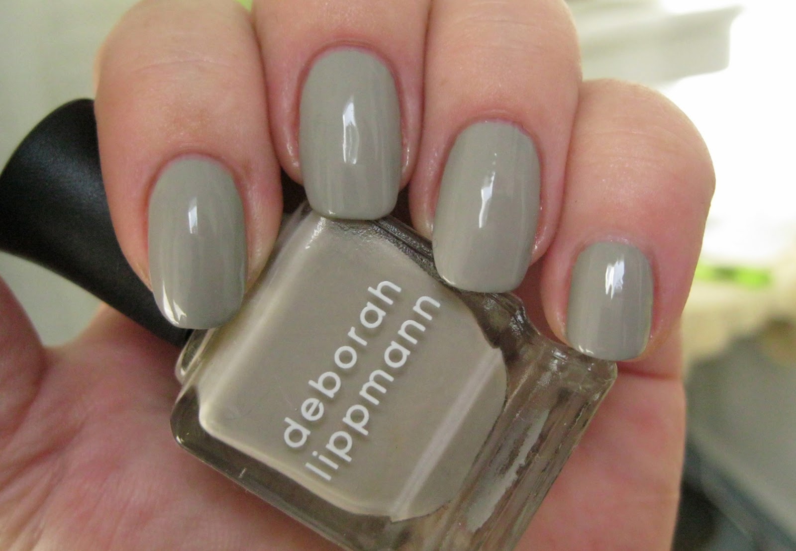
Waking Up in Las Vegas was released by Deborah Lippmann as part of a duo with I'm Not Innocent for Spring 2010. This is a light medium-toned gainsboro grey that lands slightly to the cool side of the greige/putty/grey/cement spectrum. A soft graceful neutral that is clean and chic on the nail, Waking Up in Vegas had a fabulous 15 minutes of fame when Lady Gaga wore it for the cover of the September 2010 issue of Vanity Fair, touching off a grey/griege trend that was only just leveling out when I fledged my polish enthusiast wing feathers late in 2012.


Application was pretty good. The consistency of Waking Up in Vegas is fluid and very creamy with a bit of pull to it. It's not the best self-leveler I've experienced, and my ridges do make an appearance in the photos. The next time I use it I'll double up on the ridge-filling basecoat, because this puppy is extremely well-pigmented for such a light color and it's not at all chalky either. Basically, you can get even opaque coverage in a single coat. Of course I did two to see if I could get it to level out over my ridges and was summarily DENIED but going for three seemed like overkill. Cleanup was easy and straightforward. Waking Up in Las Vegas dries naturally in good time to shade that is cooler and a touch darker than bottle color and a smooth shiny finish. 

Photos show two coats of Waking Up in Vegas over treatment and basecoat with a topcoat of HK Girl. 


Deborah Lippmann Waking Up in Vegas


Deborah Lippmann Waking Up in Vegas


Deborah Lippmann Waking Up in Vegas


Deborah Lippmann Waking Up in Vegas


Deborah Lippmann Waking Up in Vegas


Deborah Lippmann Waking Up in Vegas


Deborah Lippmann Waking Up in Vegas

The sleek sophistication of this look is surprisingly fetching after all the rich colors I've been swatching lately. It has a decidedly luxurious simplicity, like the perfect silk cami under a suit jacket, that is refined and feminine and deliciously elegant. I actually prefer the color of Waking Up in Vegas to Master Plan, which is warmer and a just a tad muddy on me. Master Plan had a more self-leveling formula, but it took three coats to get the best performance out of it. If multiple coats are involved they might as well be basecoat, so I'm keeping Waking Up in Vegas for a future swatch following the double basecoat plan. 

love,
Liz

Wednesday, July 23, 2014

Deborah Lippmann Glitter and be Gay over Zoya Ziv

Glitter and be Gay was released by Deborah Lippmann as part of the fabulous Jewel Heist collection for fall 2013. I just loved the sparkle bombs of this collection and have swatched a few of them here already, namely Fake It Til You Make It, Shake Your Money Maker and Va Va Voom. The one that I was missing and really wanted to have was Glitter and be Gay. Luckily I was able to win this on ebay.

So I've got Glitter and be Gay on my nails right now and it's extremely distracting to be pausing and staring at my nails after every sentence like I've been doing. *pauses and stares at nails* But I can't help it! This stuff is a showstopper, it's like a circus costume for your finger nails! Officially described as a "candescent canary yellow glitter," Glitter and be Gay is the sort of decadent glitter bomb you'd expect from the Jewel Heist collection. It has a transparent yellow tinted suspension base packed with a superabundance of metallic yellow, gold and metallic blue/violet hex glitters in large and small sizes, much of it holographic. The amount of rainbow colors refracting off of the holo glitters amongst flashes from the equally reflective yellow, gold and blue glitters boggles the mind. I'm afraid no still image can stand up to experiencing this kind of varicolored radiance in person. It's sensationally gaudy in the best possible way. 

Application was a hot mess. I decided to use a base polish for Glitter and be Gay, one that would have the least possible impact on the thickness of the manicure, which I anticipated (rightly) would be extensive. I chose Zoya Ziv for this job and applied one scant coat, just enough to give myself a shape to conform to with the glitter. Then came Glitter and be Gay. The consistency of this polish is thick and somewhat sticky, and the neck gets a little goopy and crowded with glitters as you use it. I ploshed and spread the first coat, getting glitters evenly distributed all the way to the edges as much as I could. The next two coats I mostly just painted on, with a little spreading here and there. After the surface of the third coat had set and was no longer sticky, I carefully and gently tamped down the glitters on all my nails with my little finger to flatten any stickups. Then I applied two coats of Gelous and a coat of Seche Vite to get the glossy, glitter-under-glass look I love so much. But I can still feel a bit of texture when I run my fingers over my nails. As you can imagine, it's a thick manicure, and I did get glitter everywhere, most of which wouldn't budge during clean up. As I said, a hot mess. Glitter and be Gay itself dries naturally in very good time to a glitter-textured finish.

Photos show three coats of Glitter and be Gay over one coat of Zoya Ziv over treatment and basecoat, with two glitter smooth coats of Gelous on top of that and one layer of Seche Vite to finish. 


Deborah Lippmann Glitter and be Gay over Zoya Ziv


Deborah Lippmann Glitter and be Gay over Zoya Ziv


Deborah Lippmann Glitter and be Gay over Zoya Ziv


Deborah Lippmann Glitter and be Gay over Zoya Ziv


Deborah Lippmann Glitter and be Gay over Zoya Ziv


Deborah Lippmann Glitter and be Gay over Zoya Ziv


Deborah Lippmann Glitter and be Gay over Zoya Ziv


Deborah Lippmann Glitter and be Gay over Zoya Ziv


Deborah Lippmann Glitter and be Gay over Zoya Ziv


Deborah Lippmann Glitter and be Gay over Zoya Ziv

Shazaam! What else can I say with nails that are the equivalent of a fully costumed Vegas showgirl? This polish is a spectacle, that's for sure, and not something you'd wear just anywhere, unless you're me. But for those times when you just gotta get your glittah on, here's one to feed your hunger and blow the hair back of all who see it. I don't think you have to do three coats, either. Two would probably be just as good over a yellow or yellow gold base. I came across a manicure using two coats of Glitter and be Gay over OPI I Just Can't Cope-acobana on Polish All the Nails, and it looks just so very awesome I can hardly stand it! Next time I wear this, it'll be over yellow!

love,
Liz

Friday, July 18, 2014

Deborah Lippmann Daytripper

Daytripper (sadly not spelled like the song that is its namesake) was released by Deborah Lippmann as part of the Shades of Summer collection for summer 2012. Officially described as a "pink melon melange," this is a vibrant medium creamy coral pink creme/jelly hybrid with a drop or two of blood orange in it to give it that high voltage, juicy summer vibe. It definitely has aspirations to neon, but remains just a step or two out of range. Even so, this is a decidedly bright, splashy, jubilant color with mood-lifting properties that would be right at home on tanned fingers next to your favorite body of water.

Application was peachy! The consistency is fluid, light and smooth, with a nice balance between fluidity and viscosity and excellent self-leveling flow over the nail. It's a well-behaved polish and those familiar with Lippmann's most user-friendly formulas will not be disappointed. Pigmentation is good. This polish does have a degree of translucence to it but goes on very evenly and builds to an opacity of preference in two to three coats as you see fit. It's the kind of lacquer that will leave darkened areas where coverage is thinner, so with my ridges I used three coats. Cleanup is easy and non-staining. Daytripper dries naturally in good time to a nice glossy finish.

Photos show three coats of Daytripper over treatment and basecoat with a topcoat of Seche Vite.


Deborah Lippmann Daytripper


Deborah Lippmann Daytripper


Deborah Lippmann Daytripper


Deborah Lippmann Daytripper


Deborah Lippmann Daytripper


Deborah Lippmann Daytripper


Deborah Lippmann Daytripper


Deborah Lippmann Daytripper


Deborah Lippmann Daytripper

This is such an awesome color! It is very very close to my current pink coral favorite, Butter London's Cakehole, although I suspect Cakehole may be a little more guava-esque with Daytripper being a tiny bit deeper thanks to its blood orange influence. Daytripper has a more translucent formula. They are fraternal twins, these two.

But you just can't go wrong with a color like this in the summertime, can you?

love,
Liz

Saturday, July 12, 2014

Deborah Lippmann I Know What Boys Like

I Know What Boys Like was released by Deborah Lippmann as part of the collection for spring/summer 2011. It was described by Lippmann as a "playful periwinkle," but I don't see periwinkle here, except for the fact that it does walk the line between blue and violet. I think it's medium-dark creamy indigo, a deep but bright color. It's perhaps just a little darker and a tad more saturated than the sort of blue you'd like to see in a pair of medium wash denim jeans. 

Application was a little messy; today was a shaky hands day and I didn't do the lovely fluid creme/jelly hybrid formula of this polish much justice. It's actually a very nice polish to apply, going on well in medium coats that were plump and glossy in their jelly-ness. Pigmentation is very good. I achieved completely opacity and even, self-leveling coverage in two coats. Due to my shakes, I had a few flooded cuticles and some squiggled edges that got straightened up with the second coat, but I had quite a bit of clean up to do. Luckily it was easy and non-staining. I Know What Boys Like dries naturally in good time to a glossy finish.

Photos show two coats of I Know What Boys Like over treatment and basecoat with a bubbly (more shaky hands business, that) topcoat of Seche Vite. It looks a little royal in some of these pics, but in person you can see that it has enough violet underpinnings to lean towards indigo.


Deborah Lippmann I Know What Boys Like


Deborah Lippmann I Know What Boys Like


Deborah Lippmann I Know What Boys Like


Deborah Lippmann I Know What Boys Like


Deborah Lippmann I Know What Boys Like


Deborah Lippmann I Know What Boys Like


Deborah Lippmann I Know What Boys Like


Deborah Lippmann I Know What Boys Like


Deborah Lippmann I Know What Boys Like


Deborah Lippmann I Know What Boys Like

This is one of those colors that is both creamy and vibrant, where the creaminess lends a soft and slightly muted quality to the appearance of the polish while the vivid, nicely saturated color maintains a sense of playful celebratory immediacy. This polish tells you that there is most definitely fun on the horizon, so it's a nice darker polish for summer that could also take you well into fall, if you have seasonal inclinations to your polish wearing. It has that dichotomy of blue and purple that would do well with cross-dyed fabrics, and I can see it as a nice complement to primary patterns also. 

I Know What Boys Like surpised me by being a little more unusual than I expected, and a little unusual also for an indigo, which is typically darker and more intense. This is a softer, lighter indigo that maintains the sort of buoyancy and cheerfulness that makes it a happy companion on the nail.

love,
Liz