Showing posts with label Essie. Show all posts

Wednesday, June 22, 2016

Essie Aim to Misbehave

Aim to Misbehave was released by mainstreamer Essie as part of the Shimmer Brights collection at the end of May this year. It's a brilliant yellow shimmer, which alone would be special enough as apparently Essie has released only one other yellow (Shorty Pants in 2008), but in addition to that it is officially designated as Essie's 1000th shade, complete with confetti-adorned celebratory cap!

Officially described by Essie as a "scandalous citron yellow shimmer," Aim to Misbehave is a saturated golden yellow that is absolutely packed with teenintzy pearly microflake shimmers, giving it a burnished, silky look on the nail. This is a bold yolky hue with a slight amber or saffron lean that I think serves to intensify its already luminous nature. No easter eggs or fluffy chicks here, this is a power yellow with a noble air. 

Application was a marvel. The consistency of Aim To Misbehave is fluid, light and smooth with a medium viscosity and an even, easy glide over the nail, a truly outstanding formula for a yellow, completely non-clumping and genuinely a pleasure to work with. Amenable to thin or thicker coats, it goes on most evenly with a bit of dry time between layers. Pigmentation is very good, with great coverage for a yellow. Visible nail line with the first coat easily builds to wearable opacity after the second. Adding a third gives a denser opacity and adds a certain richness to the color. Clean up is fairly easy, though you may have to chase down a shimmer or two. Aim to Misbehave dries naturally in average time to a slightly flat finish that looks awesome with a glossy topcoat. 

Photos show three coats of Aim to Misbehave over treatment and basecoat with a topcoat of Seche Vite.


Essie Aim to Misbehave


Essie Aim to Misbehave


Essie Aim to Misbehave


Essie Aim to Misbehave


Essie Aim to Misbehave


Essie Aim to Misbehave


Essie Aim to Misbehave


Essie Aim to Misbehave


Essie Aim to Misbehave


Essie Aim to Misbehave

Now that's a YELLOW, right? Atypical for Essie but perfectly in keeping with a target demographic of confident, spirited women who embrace adventure and enjoy life. My personal feeling is that it would be best showcased against a richer complexion than my pasty pinkage, but I have a lot of admiration for this dazzling jewel-toned shimmer. It's beautifully formulated and lively as all get out. 

After 1000 colors, Essie shows us that it still has tricks up its sleeve, and I'm all for that!

rawr,
Liz

Thursday, September 3, 2015

Essie Cashmere Bathrobe

Cashmere Bathrobe was released by Essie as part of the For the Twill of It collection for fall 2013. I was going through my stash not long ago collecting polishes to donate and came across this in one of my older swatching chutes. The minute I saw it, I knew I'd be wanting to wear it soon, so it was saved from the donation box and shuttled into a new swatching chute with other similar rediscoveries. I think I got this last winter -- it may even have been the winter before, but I remember having an ephiphanic moment about the chic glamour of grey polishes and hunting it down on ebay immediately thereafter. Well the moment passed but the thought stuck, I do think that grey is a glamorous, chic nail color and I'm really happy to be reintroduced to this particular polish.

Essie describes Cashmere Bathrobe as a "cuddly soft, true flannel gray," which to me is descriptive of the name of the polish but not the polish itself, which is actually not at all what I think of as a flannel grey -- it's darker, flintier, more edgy. I read a review where it was described as a "wet cement," and that's not far from the mark. It's a bit darker than that, kind of like a dark slate, achromatic and somewhat inscrutable. Or it would be, were it not for the sprinkling of tiny, ultrafine silver flake shimmers it carries. Not an inundation, just the handful of subtle flecky goodness that Essie knows how to do so well, just enough to make it special. 

Application was wonderful. Great formula, Essie! The consistency of Cashmere Bathrobe is quite fluid but not runny, and luxuriously creamy with a buttery glide over the nail and excellent self-leveling properties. It goes on best in thin to medium coats with a generous bead of polish on the brush. Pigmentation is very good, with completely even opaque coverage in two coats. Cleanup is easy and straightforward with a little bit of pigment travel that's not unexpected with a dark polish and no trace of staining. Cashmere Bathrobe dries naturally in very good time to a slick, glossy finish. Topcoat accentuates the presence of the shimmers.

Photos show two coats of Cashmere Bathrobe over Pretty Serious Rock On treatment and Pretty Serious All Your Base basecoat with another disappointingly bubbly topcoat of Seche Vite. I'm going to add some Restore to that Vite before my next manicure, then we'll see.


Essie Cashmere Bathrobe


Essie Cashmere Bathrobe


Essie Cashmere Bathrobe


Essie Cashmere Bathrobe


Essie Cashmere Bathrobe


Essie Cashmere Bathrobe


Essie Cashmere Bathrobe


Essie Cashmere Bathrobe


Essie Cashmere Bathrobe


Essie Cashmere Bathrobe


Essie Cashmere Bathrobe


Essie Cashmere Bathrobe


Essie Cashmere Bathrobe

A long time ago in a galaxy far, far away, I worked as a prep cook for about six months. Like the other cooks at this place, I carried a kit of my own knives to work along with a silicon carbide sharpening stone and lubricating oil. Cashmere Bathrobe's grey reminds me very much of the color of that oiled sharpening stone. It's slatey but also steely, and has an industrial vibe. The tiny silvery shimmers are a sweet contrasting touch to the impervious quality of the grey. Granted, the effect is subtle, but that just makes it all the more ingenious!

I love this deep glossy grey with its sprinkling of silvery flecks! I took it down to show Fuzzy, who promptly called it blue. I'm like, no, I think it's achromatic. She goes, well hold it next to your pants (which were very dark blue). So I did and sure enough, it looked blue! Huh, I thought. I'm going to have to rewrite my description of this polish. So I go back upstairs to my lightbox bathroom and look at it next to my pants in bright natural light. Not blue! Definitely grey! Trickster polish. I also initially thought that the silver shimmers were actually light blue, but I think that they were reflecting the blue of the sky through my skylight.

In any case, a deeply cool polish. And chic!

love,
Liz

Saturday, May 30, 2015

Essie Flowerista

So I finally got my mitts on the namesake polish of Essie's Flowerista collection for spring 2015, courtesy of an ebay auction. This is the fourth polish I've purchased from this awesome collection, the others being Blossom Dandy, Garden Variety and Petal Pushers. The two I didn't get and won't be getting are the peachy nude Perrenial Chic and the tannish camel Picked Perfect, both warm neutrals that would look horrendous on me. Based all of the reviews and photos I've seen of it online, I expected Flowerista to be my favorite of the bunch.

Flowerista is a deep saturated shade of fuchsia with a plummy purple appearance. I initially thought it WAS a purple until I compared it to the fuchsia swatches on my Joen Wolfrom color tool that I used a lot back when I was stringing beads. This kind of explains why the shade you see varies quite a bit depending on the light circumstances under which it's viewed. In indirect light, it leans to a reddish purple but in the sun the deep pink in it comes to the fore and it's a deep but vibrant fuchsia. I'm usually quite partial to plummy colors like this, my eye loves them and for me Flowerista is very much a Rebecca Minkoff sort of shade -- I love it in her bags and accessories. Not sure how I feel about it on me, however. I was expecting something a little more radiant and floral and it feels a bit subdued on my nails.

Application was pretty good. The formula has a luscious, creamy fluidity to it with a velvety flow over the nail and excellent self-leveling properties. It likes to set up fairly quickly, however, which can cause some angsty moments if you're a slow painter with a tendency to overstroke like I am. Judging from the reviews, though, most folks found the formula to be fabulous, and I can see how it would be in swifter, more dextrous hands. Pigmentation is outstanding. One coat is all you need for completely even, opaque coverage. I used two to finesse some lines left wanting after my first coat and to ensure the non-appearance of my ridges. Cleanup was surprisingly easy for a polish this well-pigmented, with just a little bit of pigment travel. Flowerista dries naturally in very good time to a smooth, glossy finish. 

Photos show two coats of Flowerista over Pretty Serious Rock On treatment and Pretty Serious All Your Base basecoat with a most regrettable, obnoxiously bubbly topcoat of Seche Vite.


Essie Flowerista


Essie Flowerista


Essie Flowerista


Essie Flowerista


Essie Flowerista


Essie Flowerista


Essie Flowerista


Essie Flowerista


Essie Flowerista


Essie Flowerista

Although I like the look of Flowerista in the last photo (despite the topcoat bubbles), overall it's just not doing it for me today. I feel a bit puny in general, though, so maybe it's a pall of malaise that's affecting my view. Normally I'm quite fond of plummy fuchsia/magenta shades. I've got a holo in a very similar color from Too Fancy Lacquer to try tomorrow. Perhaps the holo will bring me around.

love,
Liz

Thursday, May 14, 2015

Essie Petal Pushers and Shimmer Polish Jovie

Petal Pushers was released by Essie as part of the Flowerista collection for spring 2015. Along with Blossom Dandy and Garden Variety, this is makes the third polish from this collection that I've purchased, and I have my eye on collection namesake Flowerista as well. That's a record for me with Essie -- I usually buy my Essies here and there, piecemeal.

Officially described as a "smoky stone rose," Petal Pushers is a medium-light cool creamy grey with blue/purple undertones, sort of a periwinkle grey.  I wasn't that impressed by it in the bottle, especially compared to its collection-mates, but now that I have it on my nails I have to say that I love it. Wearable all year round, this is a very lovely shade that is sleek with a soft delicate graceful feel. It has a certain wistful romanticism that tugs at my heartstrings.

Application was lovely. The consistency of Petal Pushers is fluid and creamy with a perfectly balanced viscosity for painting, a velvety glide over the nail and excellent self-leveling properties. It's user friendly to a degree, amenable to thin or thicker coats as preferred and is easy to manipulate with Essie's slender round brush. Co-curricular repairs and patches will show a slight ghosting effect that disappears under topcoat. Pigmentation is excellent and some folks have managed wearable opacity in one coat but I prefer two to ensure most even coverage. Cleanup is a snap with only a trace of pigment travel. Petal Pushers dries naturally in fairly good time to a glossy finish. Sweet!

Photos show two coats of Petal Pushers over Seche Rebuild treatment and Pretty Serious All Your Base basecoat with a topcoat of Seche Vite.


Essie Petal Pushers


Essie Petal Pushers


Essie Petal Pushers


Essie Petal Pushers


Essie Petal Pushers


Essie Petal Pushers

Essie Petal Pushers

Essie Petal Pushers

Essie Petal Pushers

Essie Petal Pushers

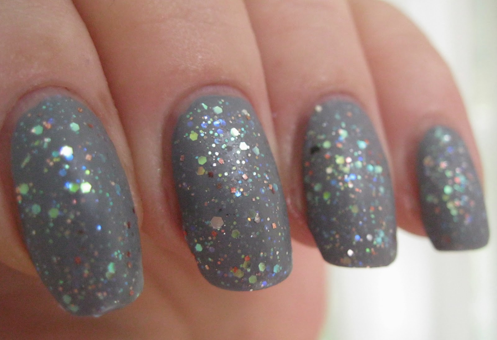
Inspired by the color scheme that my personal trainer, Tory has chosen for her upcoming wedding, I decided use Petal Pushers as a base color for Jovie from glitter polish maker extraordinaire Shimmer Polish. Tory's gown from Very Wang is a very pale blue-grey and her bridesmaids are wearing gowns in a range of colors from blush to a color not unlike Petal Pushers. Jovie is described as a pink opal holographic glitter polish. Unlike most of Cindy's creations, this is primarily a topper -- I don't think it can be layered to opacity. It's a delicate, glowing mix of pale pink and translucent glitters, some iridescent, some holographic, suspended in a transparent pink-tinted base. It has faerie-like presence that adds a dainty ethereal touch to any base polish.

Like all Shimmers that I've experienced, Jovie has an eminently user-friendly formula that can be applied like regular polish without the need for any special placement or technique. Glitter payoff is wonderful with just the right amount of components available per brushful for an even, random spread over the nail. I used one easy coat of Jovie over my Petal Pushers manicure and had no application issues. Even the few escapee glitters cleaned up in a trice. Jovie dries naturally in very good time to a shiny, slightly textured finish. To keep the look very soft while accentuating the beautiful components, I added a matte topcoat.

Photos show one coat of Jovie over the Petal Pushers manicure above followed by OPI Matte Top Coat.

Shimmer Polish Jovie over Essie Petal Pushers

Shimmer Polish Jovie over Essie Petal Pushers

Shimmer Polish Jovie over Essie Petal Pushers


Shimmer Polish Jovie over Essie Petal Pushers


Shimmer Polish Jovie over Essie Petal Pushers


Shimmer Polish Jovie over Essie Petal Pushers


Shimmer Polish Jovie over Essie Petal Pushers


Shimmer Polish Jovie over Essie Petal Pushers


Shimmer Polish Jovie over Essie Petal Pushers


Shimmer Polish Jovie over Essie Petal Pushers


Shimmer Polish Jovie over Essie Petal Pushers


Shimmer Polish Jovie over Essie Petal Pushers


Shimmer Polish Jovie over Essie Petal Pushers

Those iridescent glitters really catch the light. I did find myself wishing there were more overt pinks in the mix, but this combo has a softly-hued shimmer on the nail that is really pretty. 

Thank you for visiting my blog!

love,
Liz