Wednesday, June 25, 2014

Essie Go Ginza

Like Maximillian Strasse, Go Ginza was released by Essie as part of the Madison Ave-Hue collection for spring 2013. Go Ginza, described by Essie as a cherry blossom pink, is the other polish from this collection that spent a long time on my wishlist until recently when I was able to snag it on ebay. It's really a pale pastel lilac/purple and not a true pink, but it's every bit as delicate and dainty as anything conjured up by images of cherry blossoms.

I've read reviews of Go Ginza that praised the formula for this polish as easy to apply and opaque in two coats, but that wasn't the case for me. The consistency is nice -- fluid, creamy and dense, but the application was streaky and uneven. After two coats I could still see my ridges rising beneath the surface of the polish, so I carefully added one more coat, which camouflaged the ridges but still left the polish looking uneven and lumpy. Even a coat of the mighty Seche Vite didn't bring it totally into line. Perhaps if I leave it to age a bit this will change... hey, it's happened before! And I love this color too much not to try it again. At least cleanup was easy. Go Ginza dries naturally in average time to a glossy finish.

Photos show three coats of Go Ginza over treatment and basecoat with a topcoat of Seche Vite.


Essie Go Ginza


Essie Go Ginza


Essie Go Ginza


Essie Go Ginza


Essie Go Ginza


Essie Go Ginza


Essie Go Ginza


Essie Go Ginza


Essie Go Ginza


Essie Go Ginza, with bonus wild hair

Pastel polishes definitely bring out the worst in my camera. I wonder what that's about.

As you can see, Go Ginza takes on a pink look in some lights, but even then it's a cool pink tinged with purple. The thing is, the purple or lilac tinge is warm-toned, which keeps this polish from being too cool and stark. As I said, I love this ephemeral hue, there's something so fleeting and innocent about it. It reminds me of babies! It has a lovely graceful sense to it on the nail. Not so much girly as ladylike, but it's not prim. The color has a little bit of an edge, if a pastel can be described as edgy.

Whatever it is, it speaks to me as few pastels have.

love,
Liz

Tuesday, June 24, 2014

Picture Polish Focus

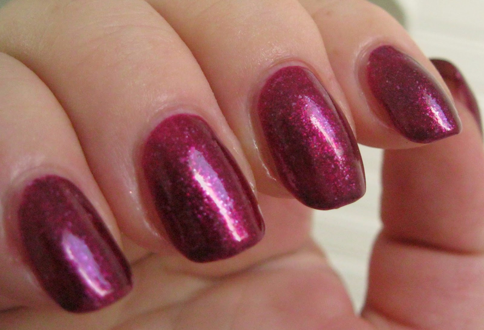
Focus was released by Australian indie polish maker Picture Polish in January this year as a limited edition collaboration shade with Sheila of the fantastic polish blog Pointless Cafe. You can see her post about this gorgeous polish here. As inspiration for her polish, Sheila chose a photo of wine cups, a purple-red/wine colored wildflower that grows and blooms abundantly over south Texas in the spring. Described on the Picture Polish website as a red/violet with a mix of silver/blue microsparks, this is a medium-dark claret colored creme/jelly hybrid with deep pink overtones containing a mix of shimmering irregularly-shaped flakies in silver and blue, which are nuanced by the beautiful purplish red base into shades of pink and purple. 

Application was pretty dreamy. It was a shaky hands day for me and I was sure I'd get polish everywhere but no, it went on quite neatly. The consistency is light and fluid but not runny, with an abundance of gorgeous flakies dispersing easily with each brushful. This polish goes on evenly and smoothly and is immediately self-leveling. Pigmentation is very good. I achieved complete opacity and bottle color in two medium coats. Cleanup was easy and straightforward. Focus dries naturally in very good time to a slightly flat finish that loves a good topcoat to pop the colors with a glossy shine.

Photos show two coats of Focus over treatment and basecoat with a topcoat of Seche Vite. 


Picture Polish Focus


Picture Polish Focus


Picture Polish Focus


Picture Polish Focus


Picture Polish Focus


Picture Polish Focus


Picture Polish Focus


Picture Polish Focus


Picture Polish Focus


Picture Polish Focus


Picture Polish Focus

Very pretty! I love the jewel-toned look of this polish in full sun, it has that lit from within look with a bright splash of magenta sparkling with flakies along the axis of light deepening to a rich blackened red-violet along the edges. It's classy, feminine color that transcends seasonal wear, with a sophisticated wine-colored glow indoors in low light and a brilliant flash of pinkish purple outside in the sun.

love,
Liz

Monday, June 23, 2014

Digital Nails I'm a Survivor

I'm a Survivor was released by indie polish maker Digital Nails last fall as one of the Alex's Lemonade Stand Charity duo. Alex's Lemonade Stand is a foundation whose mission is to raise money for and awareness of childhood cancer causes -- especially research into new treatments and cures -- and to encourage and empower others, especially children, to get involved and make a difference for children with cancer. Raphaelle donates profits from the sales of I'm a Survivor and its sister polish, When Life Gives You Lemons, to Alex's Lemonade Stand, which in turn allocates them to research purposes. It's stuff like this that let's you know how generous, circumspect and purposeful our indie polish makers are!  

I'm a Survivor is a jelly flake glitterbomb. It's got a translucent deep smoky violet jelly base that is jam-packed with irregularly shaped golden metallic flakies, and can be worn over a purple base polish or layered to opacity on its own. I chose to wear it by itself to make the most of the translucence and depth of this polish. The shardy golden flakes float in the violet jelly strata like clouds in a mackerel sky, and are nuanced by the violet into shades of bronze and purple as well as gold. 

Application required a leap of faith on my part. I wasn't sure I had the confidence to apply this dense jelly with the skill and aplomb it deserves. The consistency is fairly thick and gel-like but not sticky, and every brushload is absolutely packed with flakies. The first coat was thin and sheer with the flakies arranging themselves in streaks over the nail. All was well after a generous second coat, though. The color deepened substantially, the distribution of the flakies became regularly random and I achieved an opacity I was happy with. Cleaning up after this flakie-filled wonder is something you don't want to have to do a lot of because those flakies like to stick around. I had some that did just that, as you will see, plus a few protrusions over the free edge. All in all, though, application was much less fraught with difficulty than I expected. I'm a Survivor dries naturally in average time to a slightly textured shiny finish, which I smoothed and glossed up with topcoat.

Photos show two coats of I'm a Survivor over Seche Rebuild treatment and Pretty Serious All Your Base basecoat with a topcoat of Seche Vite. I feared that the Vite might cause some shrinkage at the tips, as the jelly is sheerest there despite wrapping, but I've had it on for a couple of hours now without any tip pull or shrinking.


Digital Nails I'm a Survivor


Digital Nails I'm a Survivor


Digital Nails I'm a Survivor


Digital Nails I'm a Survivor


Digital Nails I'm a Survivor


Digital Nails I'm a Survivor


Digital Nails I'm a Survivor


Digital Nails I'm a Survivor


Digital Nails I'm a Survivor


Digital Nails I'm a Survivor

I'm so proud of Raphaelle for her work helping make a difference for kids with cancer, and glad to be able to assist in a tiny way by purchasing this awesome polish. I love the shardy metallic mottling of the violet base by the flake glitters. It's actually quite a glamorous polish with a air of gilded vampiness to it that adds a touch of mystery to the mix. I have a feeling this one will be great during the fall and winter holidays as an interesting and charismatic alternative to the usual greens and reds that typically accompany that time of year. 

It also looks fabulous with a matte topcoat, which you can see a photo of in Potions in Motion's blog post featuring both Alex's Lemonade Stand polishes, here.

love,
Liz