Showing posts with label metallic. Show all posts

Tuesday, March 27, 2018

ILNP Short Circuit

More from ILNP! Short Circuit, also part of the Spring 2018 collection and also an Ultra Metallic "Bright," is described as a "mind-numbingly radiant" yellow with subtle green undertones. It's a blast! The color is a metallic chartreuse yellow or traditional chartreuse, a greenish yellow with lemon-lime aspects that's composed of superabundant, highly-reflective, flat metallic particles in a transparent base. Bold and beaming on the nail, this will be a crazy-good alternative to neon yellow come summertime. The metallic color is softly reflective in the way of foil polishes, with a finely-grained, piecey visual texture, loads of scintillating sparkle and a lively, gleaming flash. It absolutely glows, even in low light.

Application was great! The consistency of Short Circuit is fluid and smooth with a medium consistency and a silky, self-leveling slip over the nail that is a pleasure to manipulate with the brand's flexible, flattened-style brush. Coverage is provided by the metallic bits, which seem slightly more plentiful and dense here than they did in Hi-Fi, delivering a wearably opaque look in two medium coats. I added a third for the photos. As with Hi-Fi, cleanup looses a legion of shiny, sticky metallic bits to ensconce themselves about the nail environs, adhering to skin and nail like little limpets. I recommend going for as clean a manicure as possible from the outset and doing any necessary cleanup very carefully while the polish is still wet. Short Circuit dries naturally in very good time to a smooth, shiny finish.

Photos show three coats of Short Circuit over treatment and basecoat with a topcoat of Seche Vite.


ILNP Short Circuit


ILNP Short Circuit


ILNP Short Circuit


ILNP Short Circuit


ILNP Short Circuit


ILNP Short Circuit


ILNP Short Circuit


ILNP Short Circuit


ILNP Short Circuit

How about that?! The color can lean more to yellow or to a fresh, new-leaf green depending upon the kind of light in which it's viewed, and is brighter in person than it appears in the pics. It's definitely an in-your-face 24/7 sort of look, but I think that it's most striking in low light, where the burnished, show-stealing glow really ramps up the amperage.

love,
Liz

Sunday, March 25, 2018

ILNP Hi-Fi

Hi-Fi was just released this month by Nevada-based indie polish maker ILNP as part of the Spring 2018 collection. This and six other colors make up the Ultra Metallic "Brights" subset of the collection, foily polishes "formulated with premium ingredients for truly superior metallic finishes and effortless removal."

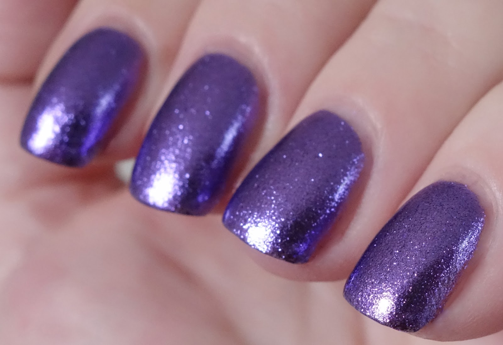
Described simply as a purple, Hi-Fi is a true medium purple, a kind of amethyst-esque shade also known more officially as web medium purple. As a foil, it's composed of minute, flat, highly-reflective metallic pieces that give it a softly-reflective, finely-grained visual texture that always reminds me of tin foil that's been crumpled and smoothed out. I used to do just that obsessively with Wrigley's aluminum foil gum wrappers (which the company replaced with paper in 2010, btw, in order to make their packaging more cost effective) and a pencil during class in middle school because: a. I was bored, and b. I loved the piecey mirror of the smoothed out foil. But being obsessive about quirky stuff like this is pretty much the raison d'ĂȘtre of every middle school student, no? Maybe it was just me.

Anyway, the foily metallic finish of Hi-Fi is gloriously glowy and loaded with fine, scintillating sparkle, especially in the sun.

Application was quite agreeable. The consistency of Hi-Fi is fluid, light and smooth with a medium viscosity and a silky, self-leveling slip over the nail. Pigmentation is somewhat sheer, especially on the first coat. Two medium-to-thicker coats will net a wearable opacity, but I think the polish looks best in three thinner coats. Any visible brushstrokes that appear during application vanish as the polish dries. Cleanup scatters tiny purple bits far and wide. Hi-Fi dries naturally in very good time to a smooth, shiny finish.

Photos show three coats of Hi-Fi over treatment and basecoat with a topcoat of Seche Vite. Any magenta-ish spots you see are my shirt reflected in the polish.


ILNP Hi-Fi


ILNP Hi-Fi


ILNP Hi-Fi


ILNP Hi-Fi


ILNP Hi-Fi


ILNP Hi-Fi


ILNP Hi-Fi


ILNP Hi-Fi


ILNP Hi-Fi

I don't seem to gravitate as much toward foils these days as I used to, but wearing this one reminds me of how much I love that special foily radiance and sparkle, and the way the tiny metallic pieces fit together on the nail like a mini mosaic -- at least, that's how I like to think of it. It's a totally different look from the super smooth, chrome-like reflectivity of straight metallics, and foils are much more forgiving to apply and do not show nailbed imperfections like straight metallics do either. I also have Short Circuit (yellow) and Love Me Not (red) from this line to show you, and I'm thinking that I may just have to go back for Blueprint and possibly Sugar Coated (rose) as well.

What about you? Do you like to wear foils? Did you pick up any of ILNP's new Ultra Metallic "Brights"?

love,
Liz

Sunday, January 21, 2018

ILNP On The Rocks

Like Rogue, On The Rocks was released this past November by Nevada-based indie polish maker ILNP as part of the Winter 2017 collections. It's part of ILNP's Ultra Metallic line of metallic-finish polishes specially formulated with ultra-thin metallic flakes, and is described as a java-brown.

The base color is a cool, taupey kind of shade, medium-dark in tone, similar to coyote brown. It is considerably lightened by superabundant, highly reflective metallic flakes in what appears to me to be silver, creating a look that is more along the lines of beaver in color, with aspects of champagne, bronze and café au lait and a brilliant foily metallic finish with tremendous sparkle. There's a sprinkling of holographic particles in there also, which are kind of lost amidst all of the reflectivity and sparkle until you get the polish into the sun. There, the piecey, foil-like visual texture of the flakes seems to smooth out a bit and a loose net of brilliant rainbow-colored sparks adorns the finish.

Interestingly, there's a surprising purple aspect to the color that comes out under LED lighting.

Application was fantastic. The consistency of On The Rocks is fluid, light and smooth with a medium viscosity and a fluent, easy, self-leveling slip over the nail that went on best for me in medium coats from a moderately-loaded brush. There is no discernible texture from the flakes, which go on flat to the nail without tumbling, stickups or protrusions over the free edge. Pigmentation is very good. Two coats nets completely even opacity and full bottle color. Cleanup frees countless tiny reflective flakes to ensconce themselves happily over the nail environs, difficult if not impossible to sweep away completely. I did my cleanup as I went along and still had sparkly nail surrounds -- best to go for as clean a manicure as possible from the outset with this one. On The Rocks dries naturally in very good time to a smooth, reflective finish.

Photos show two coats of On The Rocks over treatment and basecoat with a topcoat of Seche Vite.


ILNP On The Rocks


ILNP On The Rocks


ILNP On The Rocks


ILNP On The Rocks


ILNP On The Rocks


ILNP On The Rocks


ILNP On The Rocks


ILNP On The Rocks

This polish is much more stunning in person than it is in a still image -- you really need to see it on the move to appreciate the wonderful dynamics of the light play. It's a dazzling foily metallic look that just radiates elegance and glamour. The cool, metallic champagne-taupe color acts as a particularly stylish neutral, more interesting and, I think, even classier than gold or silver. I'm telling you, this polish is money! Dressy enough for black-tie but not in the least over-the-top or pretentious. Love it!

A clutch would be killer in this look, and shoes! Some graceful, pointy-toe kitten heels -- OMG!

xo,
Liz

Tuesday, August 1, 2017

Colors by Llarowe Emerald Illusion

Emerald Illusion was released on the first of May this year by Colorado-based indie polish maker Colors by Llarowe as the May 2017 edition of the brand's popular Polish of the Month (POTM) series. POTMs are only available from Llarowe for a 24 hour period beginning on the first of their respective months, but you can sometimes get them later from one of Llarowe's international stockists. I missed Llarowe's window for this one, as usual, and was happy to find it recently at Harlowe & Co, where it is still available.

Officially described as "a vivid teal jelly base multichrome that shifts from teal to deep blue to emerald green with emerald green shimmer," Emerald Illusion has a brilliant, saturated, medium-dark blue-green base filled with multichromatic pigment with a blue-green-purple shift spectrum as well as abundant metallic shimmers in bright malachite green. This mix results in a bevy of mobile, shifting peacock hues on the nail, ranging from a deep, bold, oceanic midnight blue with hints of indigo at its edges through all kinds of blue-greens and teals to sea green to radiant, shimmering emerald green, with a gleaming semi-metallic finish. It's pretty spectacular! In direct sun, the color reads more green or blue-green depending upon the angle at which it's viewed, shifting at the sidewalls to a deep blue and glistening with delicate net of twinkling sparkle. 

Application was amazingly good -- the formula of Emerald Illusion is about as perfect and paintable as they come. The consistency is fluid and super smooth with a medium viscosity and a fluent, even, buttery glide over the nail. Self-leveling properties are phenomenal from the get go, my ridges were completely camouflaged with the first coat. Pigmentation is very good, requiring two coats for full opacity. Cleanup is easy. Emerald Illusion dries naturally in good time to a smooth, shiny finish. 

Photos show two coats of Emerald Illusion over treatment and basecoat with a topcoat of Seche Vite.


Colors by Llarowe Emerald Illusion


Colors by Llarowe Emerald Illusion


Colors by Llarowe Emerald Illusion


Colors by Llarowe Emerald Illusion


Colors by Llarowe Emerald Illusion


Colors by Llarowe Emerald Illusion


Colors by Llarowe Emerald Illusion


Colors by Llarowe Emerald Illusion


Colors by Llarowe Emerald Illusion


Colors by Llarowe Emerald Illusion


Colors by Llarowe Emerald Illusion

The shifts in this multichrome are even more dramatic and showy in person than you see in the pics, and the colors are richer and cleaner and more saturated -- especially the greens, which feel a little diluted here. For a better idea of the range of colors, check out Alicia's excellent pics in her review of Emerald Illusion on Delishious Nails.

Today's the first of August, POTM day at Llarowe, and Leah Ann will be featuring another fabulous emerald shade, a holo this time. It will be available for 24 hours beginning at 12pm Mountain Time, here. Don't miss it!

love,
Liz

Wednesday, May 3, 2017

Different Dimension Resting Beach Face

Resting Beach Face was released in August 2016 by Indiana-based indie polish maker Different Dimension as part of the Pretty Nauti collection. Creator Missi describes this one as a "light silvery sea blue holographic polish with added shimmers." The color is a light, silky silver with just the lightest tint of azure that's kind of like an alice blue, only with a silver base instead of white. While it's metallic by nature, it has a soft rather than hi-res reflectivity and carries a pale pink sheen courtesy of abundant ultrafine pink shimmers. Holographically-generated pastel hues of blue, green and gold nuance the color beautifully in ambient light, and in the sun there's a brilliant fully linear prismatic display featuring a splendid rainbow flare that frames a gleaming lick of silvery pink and shades to a pale celeste blue at the edges of the nail.

Application was wonderful. The consistency of Resting Beach Face is fluid, light and smooth with a medium consistency and a silky, self-leveling slip over the nail. Pigmentation is very good, delivering evenly opaque coverage in two medium coats. Cleanup is easy. Resting Beach Face dries naturally in very good time to a smooth, slightly flat finish. Topcoat adds a becoming gloss and does not interfere with the holographic properties of the polish in any way. 

Photos show two coats of Resting Beach Face over KBShimmer Love You Strong Time treatment and KBShimmer Fillin' Groovy basecoat with a topcoat of Seche Vite.


Different Dimension Resting Beach Face


Different Dimension Resting Beach Face


Different Dimension Resting Beach Face


Different Dimension Resting Beach Face


Different Dimension Resting Beach Face


Different Dimension Resting Beach Face


Different Dimension Resting Beach Face


Different Dimension Resting Beach Face


Different Dimension Resting Beach Face


Different Dimension Resting Beach Face


Different Dimension Resting Beach Face


Different Dimension Resting Beach Face

The name of this polish is hilarious, I love it! It's a take-off on the "bitchy resting face" phenomenon documented by Broken People on YouTube in 2013. 

The polish generally appears silver until you get it next to a light blue, which brings out the pretty alice blue tint. I absolutely adore the pastel nuances to the color in ambient light. The have a glistening, nacreous quality and the colors make me think of Aphrodite rising from the sea at dawn, so delicate and pretty!

love,
Liz

Friday, March 24, 2017

Tonic Polish Magnetic Midnight

Magnetic Midnight was released this past December by Iowa-based indie polish maker Tonic Polish as part of the Holiday 2016 collection. Named for that time of night best suited to observing auroras, when the North or South Magnetic Pole is exactly in between the sun and an observer on the earth's surface, it is described as a royal blue scattered holographic multichrome polish with a blue/purple/red/gold shift spectrum and a sprinkling of silver holographic microglitter.

On the nail, the color most frequently on display is a beautiful medium Majorelle blue edged by indigo, but this polish is so shifty and the colors so mutable that you are always seeing more than just one, with subtle gradients through the spectrum. The blue easily morphs through royal purple to a robust Mardi Gras as you turn your nails toward your light source. Magenta appears at sharper angles still, and grows in warmth to bright red, where it finally segues through a flaming sunset color to gold. Finely-milled holographic pigment adds dimension and further nuances to the color in ambient light, dusting the semi-metallic finish of the polish with delicate silvery motes that explode into a fully linear prismatic display in direct sun, while the minute holographic microglitters create an exquisite twinkling effect as light travels over them. 

Application was trouble-free. The consistency of Magnetic Midnight is fluid, smooth and dense with a slightly thicker viscosity than I generally prefer so I added polish thinner at the outset. Thinned, it had a fluent, silky, self-leveling slip over the nail. Pigmentation is sheer. I am always amazed by how the first coat of a multichrome resembles nothing so much as grey dust in a lightly tinted suspension base, you know? This one builds remarkably well to wearably opaque coverage after the second coat, but I added a third to maximize the colors and shiftiness for the photos. Cleanup is easy. Magnetic Midnight dries naturally in very good time to a smooth, shiny finish. 

Photos show three coats of Magnetic Midnight over treatment and basecoat with a topcoat of Seche Vite.

Tonic Polish Magnetic Midnight

Tonic Polish Magnetic Midnight

Tonic Polish Magnetic Midnight

Tonic Polish Magnetic Midnight

Tonic Polish Magnetic Midnight

Tonic Polish Magnetic Midnight

Tonic Polish Magnetic Midnight

Tonic Polish Magnetic Midnight

Tonic Polish Magnetic Midnight

Tonic Polish Magnetic Midnight

Tonic Polish Magnetic Midnight

Tonic Polish Magnetic Midnight

Tonic Polish Magnetic Midnight

Tonic Polish Magnetic Midnight

Mesmerizing and very more-ish -- you see the color shifting, and you totally want MORE! Much time will be spent gazing at it, holding it up to eye level and spinning around in the sun. At least, that's what went on here today and not much else! *lol* 

Don't let the ubiquitous dusty effect of the holographic pigment in my photos mislead you. In person, it's much more subtle as well as prismatic, and the ambient colors are bold and sleek. Plus, the unexpectedly linear holographic display is fabulous! So much to see!

love,
Liz