Sunday, August 31, 2014

Bear Pawlish Divine Wine

Today's post features a new-to-me indie polish maker, Bear Pawlish out of Sacramento CA. I initially took notice of this brand when I saw this review of She's a Fish Killer on the blog From Polish, With Love, and promptly made my way to Bear Pawlish's big cartel shop to order it. It didn't take me long to fall in lust with several of Tennessee's polishes, her photos are spectacular! I simply had to order a few, including She's a Fish Killer (of course) and today's polish, Divine Wine.

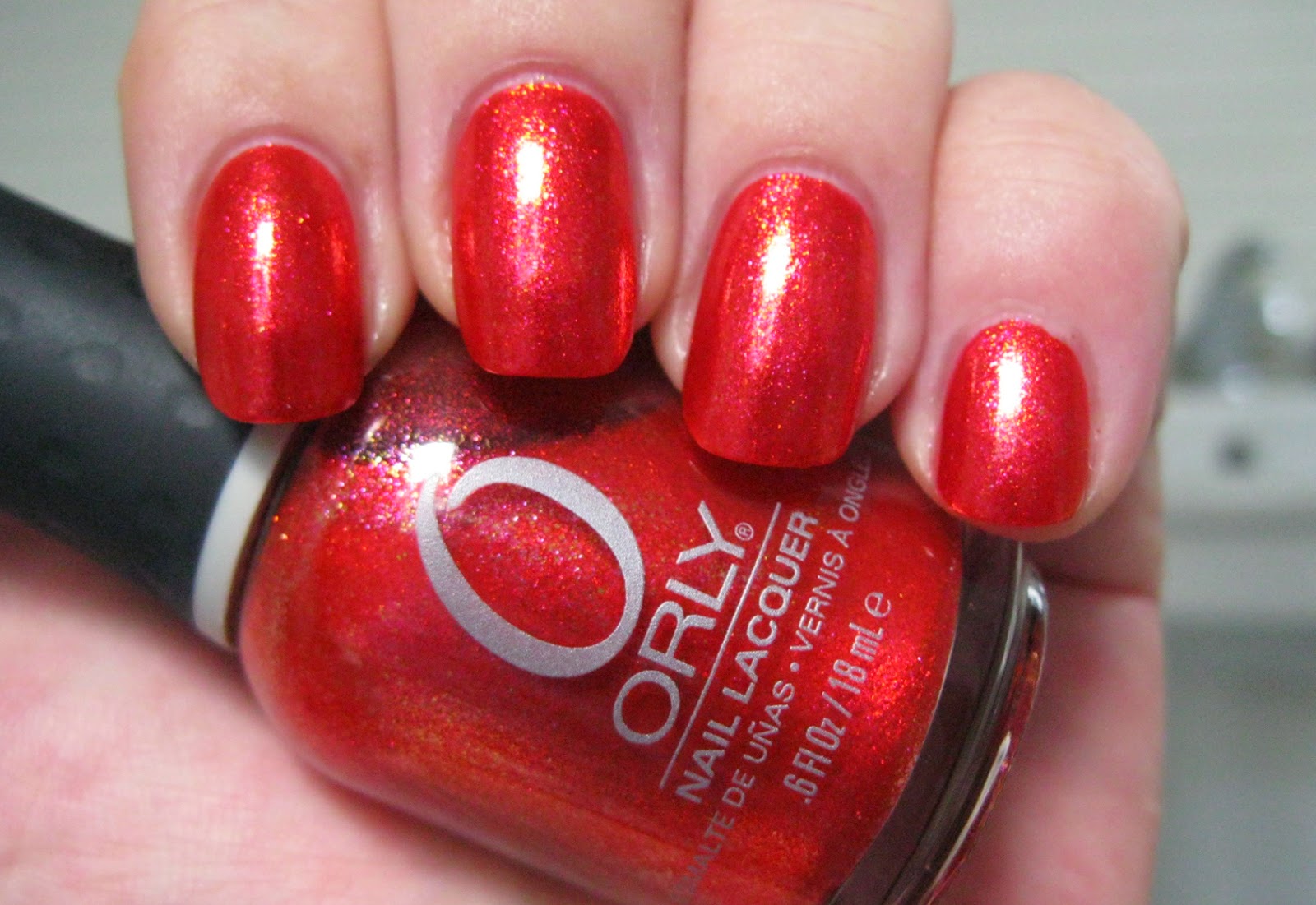
Tennessee, the owner and creative force behind Bear Pawlish, describes Divine Wine as a deep red holographic multichrome. The mutichromatic pigments in this polish produce what may well be my favorite color shift spectrum: purple/burgundy/red/gold. The predominant color is a dark dramatic red violet with a shimmering semi-metallic appearance and a ghostly linear holographic display that sits on the surface of the polish like a sprinkling of rainbow dust. The red violet shifts effortlessly and fluidly on the nail to a rich burgundy wine, to a deep rosy red with a blush of blood orange to it and finally to a peachy gold at the lowest angles to the light source. It's pretty spectacular, and was very well-received by residents and guests here in Lizland.

Application of this athletic multichrome was a visual treat. The consistency was fluid and smooth but slightly thick and I added a few drops of polish thinner to compensate. Pigmentation is excellent. I achieved completely opaque coverage and full rich color in two medium coats. Cleanup was easy and straightforward. Divine Wine dries naturally in good time to a smooth shiny finish.

Photos show two coats of Divine Wine over Seche Rebuild treatment and Pretty Serious All Your Base basecoat with a topcoat Seche Vite. In retrospect, I wish I'd have known to double up on the ridge-filling basecoat as Divine Wine with its semi-metallic finish has the propensity to emphasize nail bed flaws. The next time I wear this beauty, that's exactly what I'll do.


Bear Pawlish Divine Wine


Bear Pawlish Divine Wine


Bear Pawlish Divine Wine


Bear Pawlish Divine Wine


Bear Pawlish Divine Wine


Bear Pawlish Divine Wine


Bear Pawlish Divine Wine


Bear Pawlish Divine Wine


Bear Pawlish Divine Wine


Bear Pawlish Divine Wine


Bear Pawlish Divine Wine


Bear Pawlish Divine Wine

This polish is dramatic and gorgeous. Everyone at dinner complimented me on it, including my sixteen year old nephew. "You're nails are LONG." *lol* I wish I could have captured more of the range of color shift in my photos. Maybe next time.

love,
Liz

Saturday, August 30, 2014

Indigo Bananas Twice as Bright

"The light that burns twice as bright burns for half as long - and you have burned so very, very brightly, Roy." -- Dr. Tyrell, Blade Runner

This quote from the 1982 sci fi/film noir epic Blade Runner on indie polish maker Indigo Bananas' webpage for Twice as Bright pinpoints the source for the name of this polish. Twice as Bright was released by Indigo Bananas as part of the Fiery the Angels Fell collection, a collection inspired by the legendary Blade Runner. It's a glass fleck jelly shimmer, with a vibrant fuchsia pink jelly base absolutely crammed with blue/violet iridescent glass flecks. There's a bit of holographic pigment in here too, although it definitely takes a back seat to the luminous beauty of the glass flecks, which glow prominently from within the strata of bright pink, giving the polish a blue flash and a subtle bloom of violet when the angle of light changes. Eerie and utterly gorgeous, this polish has an irresistible color dynamic and a bold, eyecatching presence on the nail.

Application was delightful! The consistency of Twice as Bright is fluid and smooth, with a lovely even flow over the nail and excellent self-leveling properties. It has a nice balance of fluidity and viscosity that makes for a very paintable polish without a trace of the stickiness that can sometimes accompany jelly-based polishes. Pigmentation is deceptively sheer; the components account for much of the coverage so multiple coats are required for complete opacity. Two medium coats are wearable but three are better. This polish does not run or flood, but minor swipage deposits glass flecks on the cuticle and skin that take some determination and extra care to remove. Twice as Bright dries in very good time considering how fluid and workable it is during application to a silky smooth somewhat satiny finish. Topcoat provides shine and really pops the color of the glass flecks.

Photos show three coats of Twice as Bright over treatment and basecoat with a topcoat of Seche Vite.


Indigo Bananas Twice as Bright


Indigo Bananas Twice as Bright


Indigo Bananas Twice as Bright


Indigo Bananas Twice as Bright


Indigo Bananas Twice as Bright


Indigo Bananas Twice as Bright


Indigo Bananas Twice as Bright


Indigo Bananas Twice as Bright


Indigo Bananas Twice as Bright


Indigo Bananas Twice as Bright


Indigo Bananas Twice as Bright


Indigo Bananas Twice as Bright

This is exactly the sort of chunky glass fleck shimmer that provokes every kind of ecstatic flailing and fangirling from me -- I mean, look at it! So freaking gorgeous! The blue/violet iridescence of the glass flecks couched in the light-catching translucence of the bright rosy pink jelly base provide such dimensional and delicious visual texture, how can one not love this polish? The glass flecks lift themselves from the flood of pink like sands lapped by waves of some otherworldly pink sea, perhaps on an off-world colony from replicant Roy Batty's travels through the universe in search of his creator, Eldon Tyrell. 

love,
Liz

Friday, August 29, 2014

Deborah Lippmann Waking Up in Vegas

Back in May when I featured Essie Master Plan here on the blog, I lauded it for slaying my Waking Up in Las Vegas lemming based on the look of my swatches and this comparison post by Rachel of stuff I swatched. Well apparently Master Plan didn't actually touch a hair on that lemming's head, because here some three months later I find myself with what else but Waking Up in Las Vegas. I came across it up for auction on ebay and remembered only my desire to possess it and not Rachel's excellent and well-documented advice that if I had one I didn't need the other. Thus are destashable dupes created.

Waking Up in Las Vegas was released by Deborah Lippmann as part of a duo with I'm Not Innocent for Spring 2010. This is a light medium-toned gainsboro grey that lands slightly to the cool side of the greige/putty/grey/cement spectrum. A soft graceful neutral that is clean and chic on the nail, Waking Up in Vegas had a fabulous 15 minutes of fame when Lady Gaga wore it for the cover of the September 2010 issue of Vanity Fair, touching off a grey/griege trend that was only just leveling out when I fledged my polish enthusiast wing feathers late in 2012.


Application was pretty good. The consistency of Waking Up in Vegas is fluid and very creamy with a bit of pull to it. It's not the best self-leveler I've experienced, and my ridges do make an appearance in the photos. The next time I use it I'll double up on the ridge-filling basecoat, because this puppy is extremely well-pigmented for such a light color and it's not at all chalky either. Basically, you can get even opaque coverage in a single coat. Of course I did two to see if I could get it to level out over my ridges and was summarily DENIED but going for three seemed like overkill. Cleanup was easy and straightforward. Waking Up in Las Vegas dries naturally in good time to shade that is cooler and a touch darker than bottle color and a smooth shiny finish. 

Photos show two coats of Waking Up in Vegas over treatment and basecoat with a topcoat of HK Girl. 


Deborah Lippmann Waking Up in Vegas


Deborah Lippmann Waking Up in Vegas


Deborah Lippmann Waking Up in Vegas


Deborah Lippmann Waking Up in Vegas


Deborah Lippmann Waking Up in Vegas


Deborah Lippmann Waking Up in Vegas


Deborah Lippmann Waking Up in Vegas

The sleek sophistication of this look is surprisingly fetching after all the rich colors I've been swatching lately. It has a decidedly luxurious simplicity, like the perfect silk cami under a suit jacket, that is refined and feminine and deliciously elegant. I actually prefer the color of Waking Up in Vegas to Master Plan, which is warmer and a just a tad muddy on me. Master Plan had a more self-leveling formula, but it took three coats to get the best performance out of it. If multiple coats are involved they might as well be basecoat, so I'm keeping Waking Up in Vegas for a future swatch following the double basecoat plan. 

love,
Liz

Thursday, August 28, 2014

Orly Emberstone

Emberstone was released by Orly as part of the wonderful Mineral FX collection for fall 2011. It has a semi-translucent tabasco/cherry red base packed with irregularly-shaped foily metallic shimmers in gold, hot pink and bright orange. On the nail it's like a fiery metallic coalescence of red, blood orange and hot pink speckled by fine foily flecks of color, with a scintillating sparkle from the shimmers and washes of intense color over the nail that change depending upon the type and angle of light. This color of this polish is so dimensional and dynamic that the only thing I can liken it to is stained glass. All of the exquisite red, orange and pink sunset colors are here, and it shimmers and fluctuates between them exactly like colors do in the glowing coals of a fire.

Application was great! In the bottle, Emberstone looked like it was going to be kind of watery but it turned out to be surprisingly user friendly. The consistency is thin and fluid but not watery. This polish likes to go on in thin coats and it goes where you put it and stays there. Of course if you swipe a cuticle or bit of skin with a heavily loaded brush it will run and flood, but it's easy to work with in spite of that with a smooth even flow over the nail that gives you every chance for a clean manicure. Pigmentation is buildable: sheer on the first coat, nearing opacity and wearable with two and achieving completely opaque coverage with three. Great self-leveling properties, too. Cleanup takes a little extra effort if there's any flooding, which I did experience on a couple of nails (user error), as the pigmentation is quite plucky in spite of the sheerness and it will leave traces of itself tucked into cuticles and threaded over skin if you aren't thorough. The foily shimmers can be a bit recalcitrant too. But overall, this polish delivers an enjoyable application experience, even if you're a little messy like me. And it's very cool to watch the shimmers go onto the nail! Emberstone dries naturally in good time to a smooth shiny metallic finish.

Photos show three coats of Emberstone over treatment and basecoat with a topcoat of Seche Vite. 


Orly Emberstone


Orly Emberstone


Orly Emberstone


Orly Emberstone


Orly Emberstone


Orly Emberstone


Orly Emberstone


Orly Emberstone


Orly Emberstone


Orly Emberstone


Orly Emberstone


Orly Emberstone

Hot! Emberstone is every bit as bright and bold and vital in person as it is in these photos and is one of those polishes that you would wear for its own sake rather than as an accompaniment to an outfit or an occasion, I would think. It reminds me of that certain hot red-orange color of rose you sometimes see at the florist that morphs to hot reddish pink at the tips of the petals. After dark under artificial light it becomes less seething and more of a shimmery metallic blood orange. It's at its most startling and brilliant outdoors in bright indirect light, where it glows with rosy maraschino cherry and strawberry red tones.

Generally I prefer chunkier, flakier foils but Emberstone is so intensely radiant and full of energy that I can't help but adore it. It's a beautifully constructed polish, the size of the shimmers and ratio of colors work together synergistically to produce a very provocative, almost shocking color dynamic. And yet, there's an air of transience and delicacy to it also, as if something so profoundly colorful could only exist for a moment before it's gone, like the fleeting poignancy of a brilliant sunset as the last colors glow on the horizon or the dreamy evanescent shapes that appear in the flames of a fire. 

love,
Liz


Tuesday, August 26, 2014

Emerald and Ash Stubble Jumper

Note: the official appellation of this polish maker is Emerald ampersand Ash. However, I am not convinced that Blogger will properly translate an ampersand, so I am using the conjunction "and."

Stubble Jumper was created by indie polish maker Emerald and Ash in collaboration with Courtney of Swatcher, Polish-Ranger and Nail Newscast this past spring as a custom polish. With Courtney's permission, it has recently been released to the polish-buying masses as part of Emerald and Ash's Life in Color collection in July. In the North American prairie (Courtney is from Saskatchewan, Canada), the person or farmer who has to jump over the wheat stubble as he walks the fields is known as a "stubble jumper." This polish was envisioned by Courtney as a tribute to the wide-open prairie sky, trees and wheat fields.

Stubble Jumper is a serene medium-light aqua blue crelly with cerulean undertones, sort of like a mixture of robin's egg blue and teal, bearing abundant yellow and green/gold microflakes as well as sky blue shimmers. On the nail, the sweet flakies hover at the surface of the polish and below like a dusting of shimmery yellow pollen, giving the aqua a soft, washed look while the shimmers provide scintillating sparkle in direct sun. On close inspection in indirect light you can clearly see the all of the components and construction of this lovely, tranquil polish. The color of the base is in the same family as Butter London Slapper, but Stubble Jumper has a slightly dusky quality that is unusual for a medium-toned cyan.

Application was lovely. Emerald and Ash polishes come in gorgeous square, heavy bottles with architecturally stepped necks and a relative wide and well-bristled but flexible brush. The consistency of Stubble Jumper is fluid and a little sticky, but goes on easily with a well-behaved flow over the nail that doesn't pool or flood. This polish is translucent and multiple coats are required for opacity. I used three. Cleanup is easy and fairly straightforward. Sometimes with sheerish polishes it is hard to see minor swipes off the nail, but at the right angle the shimmers and flakies in this polish make them easy to spot. Stubble Jumper dries naturally in very good time to a satiny finish that loves a topcoat for gloss and to pop the colors of the components.

Photos show three coats of Stubble Jumper over Seche Rebuild treatment and Pretty Serious All Your Base basecoat with a topcoat of Seche Vite. As with Slapper, I found this color very difficult to capture accurately with my camera and had to adjust for more green as I edited the photos, thus the slightly green tinge to the surroundings.


Emerald and Ash Stubble Jumper


Emerald and Ash Stubble Jumper


Emerald and Ash Stubble Jumper


Emerald and Ash Stubble Jumper


Emerald and Ash Stubble Jumper


Emerald and Ash Stubble Jumper


Emerald and Ash Stubble Jumper


Emerald and Ash Stubble Jumper


Emerald and Ash Stubble Jumper


Emerald and Ash Stubble Jumper


Emerald and Ash Stubble Jumper

Stubble Jumper has the endearing characteristic of becoming easier and easier on the eye as you wear it. When the sun is low and long rays reach from the horizon, the cerulean tones in the polish grow, the color darkens and loses a bit of the teal green it has at midday and develops a soft golden flash where the light hits. After dark under artificial light it reads as a rich medium-dark turquoise with undertones of jade and fleeting golden sparks. Altogether charming!

love,
Liz