Sunday, July 31, 2016

KBShimmer That's Nude To Me

That's Nude To Me was released at the beginning of June this year by Indiana-based indie polish maker KBShimmer as part of the Summer 2016 collection. It's a pale vinaceous or dusky pinkish buff color, kind of like a lighter, slightly sandier variation of the color pastel pink from the ISCC-NBS Dictionary of Color Names, a light mauvey pink-toned nude with creamy clay overtones. It is packed with finely-milled holographic pigment that reads as an exquisite pale gold shimmer in ambient light, also working to create delicate nacreous hues of pink lavender, champagne and misty queen pink within the base that dimensionalize the polish on the nail. In the sun there's a dainty shimmering linear flare featuring thin arcs of pasteled prismatic colors that floats over a glistening, semi-metallic underlay of dusky golden pink. 

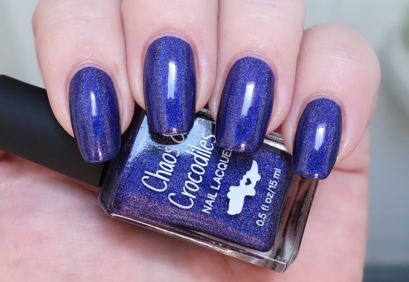
Application was divine. The consistency of That's Nude To Me is fluid, full-bodied and creamy with a medium viscosity and an easy, even sweep over the nail that self-levels like a dream. So good, and user-friendly too. I smacked the fresh polish on one nail with the non-business end of my cleanup brush (I'm coordinated like that) and took out a sizable patch. A careful dab of polish to the bare spot followed by a thin coat over all and you can't even tell it was there. Huzzah! Pigmentation is very good. A bit of sheerness to the first coat builds quickly to completely even opaque coverage with the second. Cleanup is easy, although if the color is as close to your skin tone as this one is on me you may have trouble seeing where you need to do it! That's Nude To Me dries naturally in very good time to a smooth shiny finish. Topcoat does not inhibit the holographic effects of this polish in any way.

Photos show two coats of That's Nude To Me over treatment and basecoat with a topcoat of Seche Vite.


KBShimmer That's Nude To Me


KBShimmer That's Nude To Me


KBShimmer That's Nude To Me


KBShimmer That's Nude To Me


KBShimmer That's Nude To Me


KBShimmer That's Nude To Me


KBShimmer That's Nude To Me


KBShimmer That's Nude To Me


KBShimmer That's Nude To Me


KBShimmer That's Nude To Me


KBShimmer That's Nude To Me

Every now and then a nude polish comes along that delights and gratifies so poignantly, it feels like it could have been made just for you. For me, That's Nude To Me is one of those polishes. Two nails into this manicure and the hair on the back of my neck stood up (in a good way), my jaw dropped and it was like scrolls rolled down from the heavens to the faint sound of trumpets. YNBB perfection!

For those of you who have done theater, this polish is the perfect character shoe for your nails, even better, dare I say, than In Bare Form from the Summer 2014 collection. If you have cool-toned coloring and a special place in your heart for nude holos, you owe it to yourself to check this one out. There's also a taupier variation of pinkish-nude available in the misfit section of KBShimmer's shop called Acetone It Down that looks like it would be equally beautiful on richer complexions. 

There's nothing quite like the thrill of being caught off-guard by an utterly gorgeous polish. Thanks, Christy Rose -- I needed that!

ttnt, 
Liz

Saturday, July 30, 2016

Emily de Molly Pending Perfection

Like Brick by Brick, Pending Perfection was released at the end of May/beginning of June this year by Australian indie polish maker Emily de Molly (EdM) as part of a special trio of polishes with which creator Hayley celebrated the brand's fourth anniversary. She describes it as a "light mint green creme with a very heavy red to gold duochrome shimmer throughout," and calls it her ideal shimmer polish, a year in the making. 

The color is a cool desaturated Paris green, close to Crayola's magic mint but perhaps a tiny bit brighter, a creamy, copper patina sort of shade. It's packed with ultrafine particulate shimmers that read anywhere from pink to gold to coral depending upon viewing circumstances, creating an extraordinary diffuse glowing sheen along the axis of light that seems to emanate from deep within the polish. The base color brightens and intensifies in direct sun to an aquamarine hue, while the shimmers show as a flush of twinkling coral sparks that shift to gold at certain angles to the light.

Hayley mentioned in a blog post that the formula for this polish wasn't as great as she would have liked it to be (hence PENDING perfection), compromised a bit in order to maintain the effects of the shimmers. I must respectfully disagree, as I think the formula is fantastic, especially for a shimmer-laden pastel shade. The consistency of Pending Perfection is fluid, light and super smooth with an eminently paintable, thin-to-medium viscosity and a buttery glide over the nail. The initial coat goes on sheerly with some streaks and patchiness, but it magically smooths and evens itself out as it sets up, right before your eyes! Some folks might be able to render wearably opaque coverage with a tiny bit of visible nail line in two coats on smooth, regular nail beds. My ridges required three, with such beautiful results that I didn't begrudge that third coat one bit. Cleanup is fairly straightforward with a tiny bit of pigment travel. Pending Perfection dries naturally in very good time to a smooth, somewhat flat finish that wants a good topcoat to look its best.

Photos show three coats of Pending Perfection over treatment and basecoat with a topcoat of Seche Vite.


Emily de Molly Pending Perfection


Emily de Molly Pending Perfection


Emily de Molly Pending Perfection


Emily de Molly Pending Perfection


Emily de Molly Pending Perfection


Emily de Molly Pending Perfection


Emily de Molly Pending Perfection


Emily de Molly Pending Perfection


Emily de Molly Pending Perfection


Emily de Molly Pending Perfection


Emily de Molly Pending Perfection


Emily de Molly Pending Perfection


Emily de Molly Pending Perfection


Emily de Molly Pending Perfection


Emily de Molly Pending Perfection

The shimmer effects are even more noticeable in person. Aren't they marvelous with that summery green? So dimensional and sleek. Like silk! This is such a classy look, so money -- it feels like something Chanel would do. Amazing polish!

ttyl,
Liz

Friday, July 29, 2016

Chaos & Crocodiles Cosmic Crystal

Like Narwhals Eat Macarons Too, Cosmic Crystal was released last month by indie polish maker Chaos & Crocodiles (C&C) as one of three June 2016 limited edition custom polishes that Sarey created exclusively for members of the Hella Holo Customs (HHC) Facebook group. Officially described as a dark blue-purple holo, the color a deep but lively indigo with aspects of brilliant ultramarine. It's a changeable shade, as most blue-purples are, and will appear more blue or more violet depending upon the circumstances in which it's viewed, going from a deep creamy violet under incandescent lighting to a vibrant ultramarine in bright reflected natural light. Superabundant finely-milled holographic pigment gives the polish a delicately speckled appearance in ambient light and dimensionalizes it with shifting hues of blue-violet, ultramarine, dark sapphire and violet. In direct sun, there's a perfectly delineated prismatic flare predominated by an arc of utterly dazzling azure edged by thin sparkling ribbons of the other rainbow colors before shading to deep indigo around the edges of the nail, the whole floating over a glistening, semi-metallic underlay of silvery indigo. 

Application was fabulous. The consistency of Cosmic Crystal is fluid, light and creamy with a medium viscosity and a fluent, self-leveling glide over the nail. It's a user-friendly crelly-ish formula that is amenable to thin or thicker coats and just generally a delight to work with. Pigmentation is excellent. Wearably opaque coverage can be had in a single coat, but you'll want two for richest color and to make the most of its holographic properties. Cleanup is fairly straightforward with a little bit of pigment travel but almost no residual staining -- hooray! Cosmic Crystal dries naturally in very good time to a gorgeous glossy finish, so nice! Topcoat does not interfere with the holographic effects of this polish in any way that I could tell.

Photos show two coats of Cosmic Crystal over treatment and basecoat with a topcoat of Seche Vite.


Chaos & Crocodiles Cosmic Crystal


Chaos & Crocodiles Cosmic Crystal


Chaos & Crocodiles Cosmic Crystal


Chaos & Crocodiles Cosmic Crystal


Chaos & Crocodiles Cosmic Crystal


Chaos & Crocodiles Cosmic Crystal


Chaos & Crocodiles Cosmic Crystal


Chaos & Crocodiles Cosmic Crystal


Chaos & Crocodiles Cosmic Crystal


Chaos & Crocodiles Cosmic Crystal


Chaos & Crocodiles Cosmic Crystal


Chaos & Crocodiles Cosmic Crystal


Chaos & Crocodiles Cosmic Crystal


Chaos & Crocodiles Cosmic Crystal


Chaos & Crocodiles Cosmic Crystal

Every holo enthusiast should have a good indigo in their collection and this is a particularly fine one with excellent vibrant color, a gorgeous linear display and a near flawless formula. What's not to love? 

xo,
Liz

Thursday, July 28, 2016

Chaos & Crocodiles Narwhals Eat Macarons Too

Narwhals Eat Macarons Too was released last month by indie polish maker Chaos & Crocodiles (C&C) as one of three June 2016 limited edition custom polishes created by Sarey exclusively for members of the Hella Holo Customs (HHC) Facebook group. It is officially described as a creamy light aqua holo, and I agree. The color is an exquisite celeste blue, a milky cyanic shade with a gorgeous semi-translucent, vitreous aspect. If sea glass and fine porcelain had a baby, it would look like this polish. Abundant finely-milled holographic pigment veils the color with a net of delicate sparkle and creates a vestigial prismatic flare in direct sun.

Application was lovely. The consistency of Narwhals Eat Macarons Too is fluid, light and creamy with a thin-to-medium viscosity and a smooth, even, self-leveling glide over the nail. Excellent formula, especially for a pastel, and even though it's a fast dryer it still gives you plenty of time to finesse the application. Pigmentation is excellent, almost a one coater, but a bit of translucence to the first coat requires a second for most complete opacity and best rendering of the holographic effects. Cleanup is easy and straightforward. Narwhals Eat Macarons Too dries naturally in very good time to a smooth shiny finish. 

Photos show two coats of Narwhals Eat Macarons Too over KBShimmer Love You Strong Time treatment and Pretty Serious All Your Base basecoat with a topcoat of Seche Vite.


Chaos & Crocodiles Narwhals Eat Macarons Too


Chaos & Crocodiles Narwhals Eat Macarons Too


Chaos & Crocodiles Narwhals Eat Macarons Too


Chaos & Crocodiles Narwhals Eat Macarons Too


Chaos & Crocodiles Narwhals Eat Macarons Too


Chaos & Crocodiles Narwhals Eat Macarons Too


Chaos & Crocodiles Narwhals Eat Macarons Too


Chaos & Crocodiles Narwhals Eat Macarons Too


Chaos & Crocodiles Narwhals Eat Macarons Too


Chaos & Crocodiles Narwhals Eat Macarons Too


Chaos & Crocodiles Narwhals Eat Macarons Too


Chaos & Crocodiles Narwhals Eat Macarons Too


Chaos & Crocodiles Narwhals Eat Macarons Too


Chaos & Crocodiles Narwhals Eat Macarons Too

How pretty is that, eh? Flippin' exquisite! It's the color that a clear sky takes on low to the horizon, and of larimar, a volcanic blue gemstone found only the Dominican Republic. It also has a certain glacial quality that reminds me of my nail polish bff Marisa from Montana, who loves icy blue shades with a bit of sparkle like this one.

This gorgeous dimensional pool blue is simply lovely on the nail, with an especially clean, graceful, serene sense to it. Gazing at it, I imagine a tropical vacation scene in a place where time is weightless and slow, the water is cool and bright and the drinks come in tall frosty glasses garnished with fresh fruit and little paper umbrellas. 

love,
Liz