Monday, July 31, 2017

Literary Lacquers Lettie's Ocean

Lettie's Ocean was released towards the end of June this year by New Mexico-based indie polish maker Literary Lacquers. Creator Amy describes it as a "soft turquoise holo with holo sparkle." To my eye, the base color is similar to iceberg blue, a gentle, creamy, translucent medium-light variation of azure with a hint of silvery grey to it (more so in person than my photos show) and aspects of sky blue and denim. Abundant finely milled holographic pigment gives it a heathery look and creates dimensionalizing hues of cornflower, steel blue and misty jordy blue on the nail. Holographic microglitters dot the look with tiny silvery squares that emit a delicate prismatic twinkle as light travels over them. In the sun, the color brightens noticeably to more of a true sky blue shade, and there's a lovely linear holographic flare with a predominant arc of bright azure edged by a shimmering corona of mixed prismatic sparkle that frames a semi-metallic lick of pale silvery blue grey and deepens to a silver lake blue at the sidewalls of the nail. 

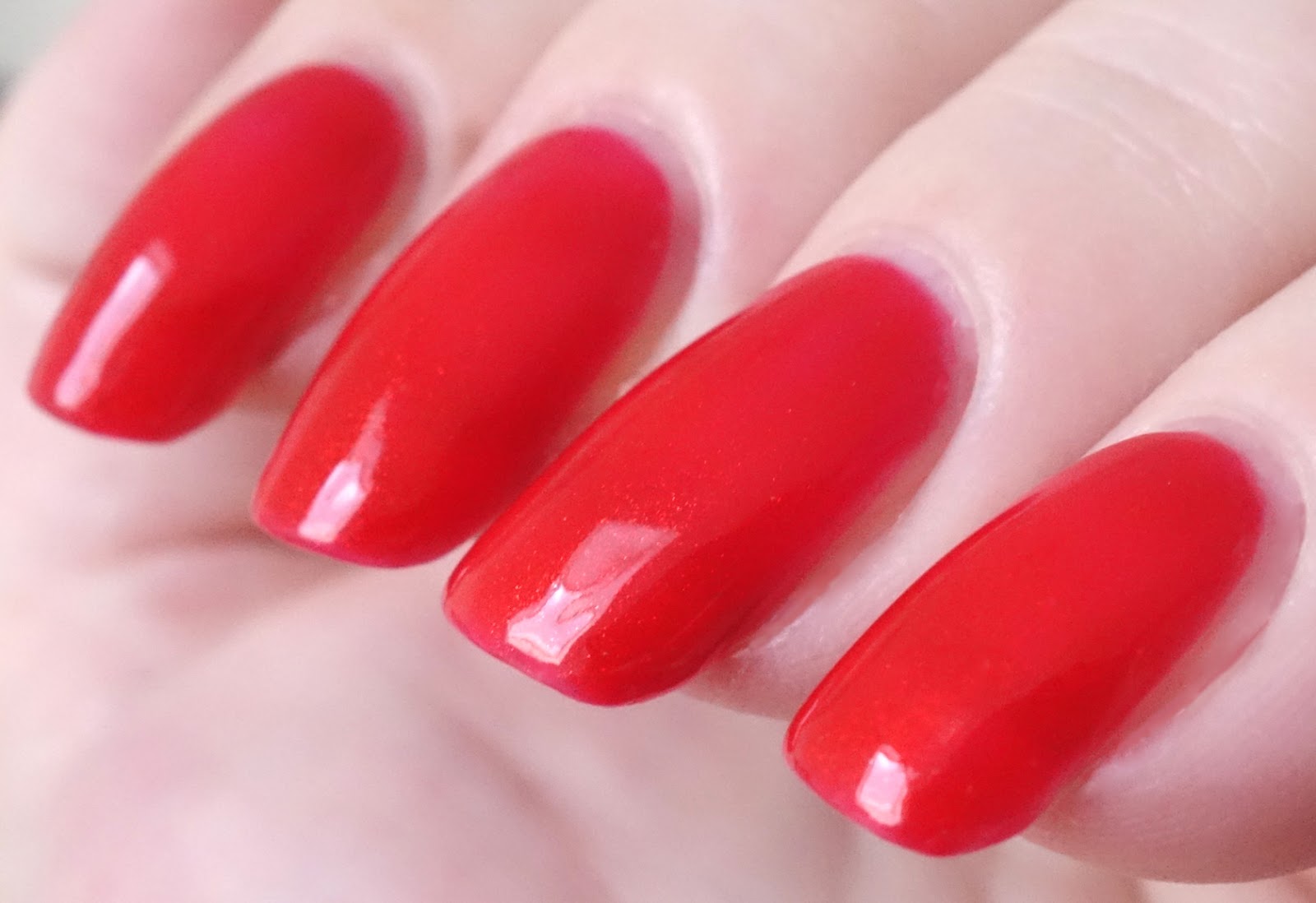
Application was fabulous. It's been a while since I've swatched one of Amy's creations and I see that she has changed her brush! It used to be round, but now it's flat, with a long flat stem that has a distinctly elegant feel as you wield it. I love it! The consistency of Lettie's Ocean is fluid, full-bodied and smooth with a medium-to-thicker consistency to which I added polish thinner at the outset. Thinned, it still retained a good bit of density but glided on evenly and easily and self-leveled like a dream. Pigmentation is very good, delivering full opacity in two coats. Cleanup is easy. Lettie's Ocean dries naturally in very good time to a mostly smooth, shiny finish with a tiny bit of discernible texture from the microglitters, easily smoothed by topcoat. Topcoat does not affect the holographic properties of the polish at all. 

Photos show two coats of Lettie's Ocean over treatment and basecoat with a topcoat of Seche Vite. A note about the color -- it's a little bit brighter in the ambient light photos than what my eye sees in person, where it has a duskier, more complex quality. The sun shots are about right.


Literary Lacquers Lettie's Ocean


Literary Lacquers Lettie's Ocean


Literary Lacquers Lettie's Ocean


Literary Lacquers Lettie's Ocean


Literary Lacquers Lettie's Ocean


Literary Lacquers Lettie's Ocean


Literary Lacquers Lettie's Ocean


Literary Lacquers Lettie's Ocean


Literary Lacquers Lettie's Ocean


Literary Lacquers Lettie's Ocean


Literary Lacquers Lettie's Ocean

This is a gorgeous polish! The gentle quality of the blue has a distinct Literary Lacquers feel to it as do the twinkling microglitters. It is light and graceful on the nail, very easy to wear casually but still feels special. LOVE! If you've never tried Literary Lacquers before, I recommend this one as an excellent introduction to the brand. Blue lovers take note, you might just need this lovely, elegant shade in your stash!

xo,
Liz

Sunday, July 30, 2017

Fair Maiden Polish Cruel Summer

Like Sunglasses at Night, Cruel Summer was released earlier this month by Minnesota-based indie polish maker Fair Maiden Polish as part of the Summer 2017 collection. The polish shares its name with the 1983 song "Cruel Summer" by British girl group Bananarama, which reached the top ten on the Billboard Hot 100 during summer 1984. 

Officially described as "a juicy neon melon with purple shimmer," this color is hot! It's kind of like if you took a creamy, dense medium-light rosy pink like Baker-Miller pink, amped up the intensity bigly and gave it electric tea rose orange overtones. It's filled with tiny light purple microflake shimmers that create a radiant, cool, misty swath of hot pink along the axis of light, dimensionalizing the look and contrasting nicely with the searing orangey-pink tinge that resides around the edges of the nail. 

Application was delicious. The consistency of Cruel Summer is fluid, light and smooth with a medium viscosity and a nearly effortless, creamy, self-leveling slip over the nail, a fantastic formula that goes right where you put it and stays there and is amenable to thin or thicker coats as preference dictates. Pigmentation is very good. A bit of sheerness with a dark streak or two on the first coat builds easily to evenly opaque coverage with the second, although I added a third coat, which it really didn't need. I could have sworn I saw smile lines, but when the effect persisted after the third coat I realized it was an illusion created by the intensity of the color. Now you know, it only needs two, no matter what your eyes tell you!

Cleanup is fairly straightforward -- the shimmers like to stick to the nail a little bit but they will come off with patience. Cruel Summer dries naturally in very good time to a silky smooth, semi-matte finish. Topcoat accentuates the presence and glow of the shimmers, which appears to diffuse the natural glossiness of the topcoat somewhat -- another visual effect in this polish's bag of tricks. 

Photos show three coats of Cruel Summer over treatment and basecoat with a topcoat of Seche Vite. 


Fair Maiden Polish Cruel Summer


Fair Maiden Polish Cruel Summer


Fair Maiden Polish Cruel Summer


Fair Maiden Polish Cruel Summer


Fair Maiden Polish Cruel Summer


Fair Maiden Polish Cruel Summer


Fair Maiden Polish Cruel Summer


Fair Maiden Polish Cruel Summer


Fair Maiden Polish Cruel Summer

Fabulous! You gotta love it!

xo,
Liz

Saturday, July 29, 2017

Don Deeva Blood Of My Enemies

Blood Of My Enemies was released -- I think -- about the same time as Sporca Puttana, in May this year by Florida-based indie polish maker Don Deeva as a stand-alone polish. Described as a red jelly with "unicorn pee" red-to-green colorshifting pigment, I have to say that it's the most charismatic red I've experienced in a long time. The base color is a translucent, almost transparent, shade of crimson or cerise. With assistance from the red colorshifting pigment, it warms as you layer it on, evolving into a brilliant, glowing, medium-toned Munsell red that looks like stained glass lit by the sun or highly polished enamel. It retains a degree of transparency, allowing plenty of light to penetrate and fire up the colorshifting pigment, which takes on an ember-like glow within the base. The pigment doesn't seem to show any definitive shifting in this polish, but it does add some excellent interior illumination to the color along with a mist of tiny, twinkling red sparks in direct light.

Application was fantastic. The consistency of Blood Of My Enemies is fluid and super smooth with a medium viscosity and a light, incredibly buttery, self-leveling slip over the nail, a gorgeous, eminently-paintable formula that is immensely gratifying to work with. It's amenable to thinner or thicker coats, but I suggest using medium coats at least as pigmentation is quite sheer. I used three medium coats for this manicure, and although you can see hints of nail line at certain angles the color is magnificent. Make sure to wrap your tips with each coat to avoid any extra sheerness there! Cleanup is easy. Blood Of My Enemies dries naturally in good time to a beautiful glossy finish. Topcoat amps up the natural glossiness of the polish and accentuates the presence and effects of the shimmers.

Photos show three coats of Blood Of My Enemies over treatment and basecoat with a topcoat of Seche Vite.


Don Deeva Blood Of My Enemies


Don Deeva Blood Of My Enemies


Don Deeva Blood Of My Enemies


Don Deeva Blood Of My Enemies


Don Deeva Blood Of My Enemies


Don Deeva Blood Of My Enemies


Don Deeva Blood Of My Enemies


Don Deeva Blood Of My Enemies


Don Deeva Blood Of My Enemies


Don Deeva Blood Of My Enemies


Don Deeva Blood Of My Enemies

I've seen manicure photos posted in the Deeva La Familia, Don Deeva's Facebook fan group, where Blood Of My Enemies was layered over an opaque base, a red or a nude, I presume due to the transparency of the formula. I considered doing this also, but I'm really glad that I went the non-undies route as the quality of the color is incredible: bold, brilliant, rich, dimensional, luminous. It has a certain retro, romantic, 50s kind of vibe, but make no mistake -- this is a power red and drop dead sexy. Utterly captivating! If you are a lover or collector of reds, don't pass this one up!

love,
Liz

Friday, July 28, 2017

Different Dimension Tropic Like It's Hot

Tropic Like It's Hot was released at the beginning of this month by Indiana-based indie polish maker Different Dimension as part of the Sun of a Beach collection, a series of five jelly-based neon polishes with added color-shifting glitters and holographic microflakes. This is the orange of the series, and it's a vibrant, expansive, "primary" sort of neon orange, very clean and nicely balanced by a milky translucence that reminds me of fresh-squeezed oj and gives it a bit of that sunbleached vibe. The energy is buoyant and convivial, not stark or frenetic. Really pretty! It's packed with glitters and silvery holo flakies, which create a flecked visual texture and emit variously-sized sparks and gleams of amber, orange and red-orange.

Application was very nice. The consistency of Tropic Like It's Hot is fluid, light and fluffy with a medium consistency and a fluent, even, self-leveling glide over the nail. There's slight sense of extra bulk to it from all of the components, with a bit of tumbling on the part of the glitters but no egregious stacking and no stickups at all. Pigmentation is sheerish, building to evenly opaque coverage in three coats for me. I did my cleanup as I went along and had no issues. Tropic Like It's Hot dries naturally in very good time to a shiny finish with considerable texture from the glitters. For a glassy smooth look, I double topcoated with a layer of gel-effect topcoat followed by quick-dry. 

Photos show three coats of Tropic Like It's Hot over basecoat with a double topcoat of Pretty Serious Plump Up the Volume plus Seche Vite.


Different Dimension Tropic Like It's Hot


Different Dimension Tropic Like It's Hot


Different Dimension Tropic Like It's Hot


Different Dimension Tropic Like It's Hot


Different Dimension Tropic Like It's Hot


Different Dimension Tropic Like It's Hot


Different Dimension Tropic Like It's Hot


Different Dimension Tropic Like It's Hot


Different Dimension Tropic Like It's Hot


Different Dimension Tropic Like It's Hot

This is a most companionable neon -- it feels like it's actually happy to be on your nails! I love the fresh, clean quality of the color, which adds a certain sweetness to its intensity and flatters the nails. I also like the sparkle, it strikes me as a graceful accompaniment to the color. This would make a great summer pedicure shade, I think. I've always done my own nails and have never been to a nail salon, but maybe this is the polish for that first salon pedicure.... 

love,
Liz

Thursday, July 27, 2017

Ellagee Nightspark

Like Heartstone, Nightspark was released this month by Texas-based indie polish maker Ellagee as part of a trio of custom, limited edition polishes for July 2017 created by Laura exclusively for members of the Hella Holo Customs Facebook group. This one is described as "a blurple linear holo with pink shimmer and multicolored iridescent flakes." The base color is a translucent darkish variation of denimy sapphire similar to liberty from the ISCC-NBS Dictionary of Color Names. Swimming within are beaucoup variously-shaped iridescent flakies, sized from tiny particles to relative large shardy flakes, which gleam brightly in rich, metallic jewel-toned hues as light hits them. Abundant finely-milled pink shimmers combine with the base color to give the polish a transparent royal purple glow in ambient light. The holographic properties come to the fore in the sun, creating a dazzling blanket of prismatic sparkle supplemented by brilliant jewel-toned sparks from the flakies.

Application was a deliberate, careful process. The consistency of Nightspark is fluid, full-bodied and somewhat bulky from the components, with a thicker viscosity to which I added polish thinner at the outset. By and large, the flakies go on smoothly and lay flat (I ended up with only one significant stickup), but some of them are quite sizeable, requiring a bit of care to position satisfactorily on the nail, and one or two were so disproportionately large that I quickly brushed them off altogether. Pigmentation is sheer by design, building to wearable opacity in three coats. I did my cleanup as I went along and had no issues. Nightspark dries naturally in good time to a shiny, textured finish, mostly smoothed by topcoat.

Photos show three coats of Nightspark over KBShimmer Fillin' Groovy basecoat with a topcoat of Seche Vite.


Ellagee Nightspark


Ellagee Nightspark


Ellagee Nightspark


Ellagee Nightspark


Ellagee Nightspark


Ellagee Nightspark


Ellagee Nightspark


Ellagee Nightspark


Ellagee Nightspark


Ellagee Nightspark


Ellagee Nightspark


Ellagee Nightspark


Ellagee Nightspark


Ellagee Nightspark

While the base color is an elegant and serene dark blue, the abundance of colorful flakies in concert with the pink shimmers and holographic pigment in this polish give it a certain sense of extravagance and a rich, ornamental quality that is much more complex in person than can be seen in a photo. In ambient light, the effect is kind of like looking at one of Monet's darker water lily paintings, an immersive waterscape of reflectivity and depth within which reside delightful splashes of color, disparate but entirely coherent to the scene.

love,
Liz