Saturday, April 30, 2016

Octopus Party Nail Lacquer Going Coastal

Going Coastal was released last month by Connecticut-based indie polish maker Octopus Party Nail Lacquer (OPNL) as one of several new stand-alone shades for spring. Described by creator Dave as a turquoise creme with subtle shimmers, it's an excellent match to the web color azure aka azure mist, which despite the name is actually a white-based tint of cyan. At least on me it is, against my very pink skin. I'm thinking it may pull less cyan, more azure on warmer, richer skintones, to appear more as an Alice blue. Either way, it's a lovely minty blue pastel shade with a clean, tranquil vibe. Aptly named, it feels perfect for the beach. I suspect the shimmer may make a difference in the application, but it's not really visible on the nail.

Application was a journey to opacity. The consistency of Going Coastal is fluid, light and creamy with a medium viscosity and a smooth, easy flow over the nail. Although it self-levels very well physically, visually it is streaky in the way of white-based polishes, especially over nail ridges. Pigmentation is good. If you have a very skilled and even hand, a la Nichole of Bedlam Beauty, it's possible to achieve wearable coverage in two coats, but I think most folks will need three. I still had dark areas after three coats that worried me enough to add a fourth on my swatching hand (the left), but I left my right hand at three so I could compare them after topcoat. And to my surprise, they looked almost exactly the same! Lo, the manicure-saving grace of Seche Vite! I would say keep your coats light and thin for the first two and ignore the streaks. Apply a generous third coat from a bead-loaded brush with a light hand and suspend appraisal until after topcoat. Cleanup is a breeze. Going Coastal dries naturally in very good time to a smooth shiny finish that takes particularly well to topcoat.

Photos show three to four coats of Going Coastal over treatment and basecoat with a topcoat of Seche Vite.


Octopus Party Nail Lacquer Going Coastal


Octopus Party Nail Lacquer Going Coastal


Octopus Party Nail Lacquer Going Coastal


Octopus Party Nail Lacquer Going Coastal


Octopus Party Nail Lacquer Going Coastal


Octopus Party Nail Lacquer Going Coastal


Octopus Party Nail Lacquer Going Coastal


Octopus Party Nail Lacquer Going Coastal


Octopus Party Nail Lacquer Going Coastal


Octopus Party Nail Lacquer Going Coastal

Kinda dreamy, no? I am shocked at how much I'm loving this! This is the very sort of pastel shade that I decried not a week ago, and here I am taking every opportunity to gaze at my nails, easy to do since it's the sort of color that makes you very conscious of your manicure (in a really good way). So very worth the journey to opacity, I know I will wear this again come summer. 

love,
Liz

Thursday, April 28, 2016

Cirque Colors Whitney

Like Rhapsody in Blue and Key to Gramercy, Whitney was released at the beginning of last month by NYC-based indie polish maker Cirque Colors as part of a seasonal addition to Cirque's ongoing Metropolis collection, a series of creme-finished lacquers dedicated to New York City. Creator Annie describes Whitney as a "dusty pink-lilac." It has the appearance of a very pale white-based tint of orchid pink with an added smidge of lilac, just enough to give it a soft dusky ambiguity. The influence of one side of the spectrum over the other has mostly to do with lighting, but it's a tricksy little thing. In some of my photos, it looks pink. In some, lilac. In person, same thing. In any case, this delicate shade is gentle and luminous on the nail, with a very clean, Jordan almond kind of look that is quite flattering to the fingers and hands. 

Application would have been more delicious had it not been Invasion of the Tiny Fibers Day here (it's a thing, really!). The consistency of Whitney is fluid, creamy and dense with a medium viscosity and a plush, self-leveling glide over the nail. The formula, as with Key to Gramercy, is outstanding for a white-based polish. Pigmentation is also outstanding. With a well-loaded brush and a light touch, even opacity can be had in one coat. One coat! I do not have a light hand, alas, so I needed a second to cover a streak or two and that's when a slew of tiny fibers appeared. After doing several extractions from the second coat, I finally decided that I needed to add a third. But I can tell you that this is definitely not a preference -- two coats max is best. Clean up is easy with a skosh of pigment travel. Whitney dries naturally in very good time to a smooth glossy finish.

Photos show three coats of Whitney over treatment and basecoat with a topcoat of Seche Vite.


Cirque Colors Whitney


Cirque Colors Whitney


Cirque Colors Whitney


Cirque Colors Whitney


Cirque Colors Whitney


Cirque Colors Whitney


Cirque Colors Whitney


Cirque Colors Whitney


Cirque Colors Whitney


Cirque Colors Whitney

Pink, lilac, pink-lilac -- it's all good! I did not anticipate admiring this polish as much as I do. Despite it's opacity, it has a dimensional quality that gives the illusion of depth and luminosity. Not what I expected from a pastel, but there you go. I don't think you'll hear any more whining from me about how my skintone doesn't get along with pastels!

Very, very nice!

xo,
Liz

Wednesday, April 27, 2016

ILNP Daisy Jane

Daisy Jane was released last month by Nevada-based boutique polish maker I Love Nail Polish (ILNP) as part of the Spring 2016 collection. Creator Barbra characterizes this as a baby pink  scattered holographic polish with added gold microflake shimmers and a sprinkle of red particulate shimmers. Pastel plus! 

The polish has a distinct mauve lean in the bottle, giving it a sort of pink lavender appearance that makes me think of chilly flesh, not the most inviting image, and I was apprehensive about whether it would be able to hold its own against my rubicund skintone. On the nail, it warms slightly but remains duskier than what I think of as a traditional baby pink, with lavender and grey tones to it, kind of like a cameo pink, maybe. In ambient light and shade, Daisy Jane has a slightly more mauve tone and there's a degree of translucence to the formula that gives it a delicate and dimensional aspect. Abundant relatively large holographic particles create a lovely twinkle in bright indirect light that becomes beautifully prismatic in the sun, where you can even see a vestigial linear flare at some angles. And although the gold microflake and red particulate shimmers are not immediately noticeable you will occasionally spot a golden gleam or bright red spark that adds visual interest to the gentle dimensionality and light play of the polish. 

Application was really nice. The consistency of Daisy Jane is fluid, light and creamy with a thin-to-medium viscosity and a silky, self-leveling slip over the nail, very agreeable to work with and easy to manipulate with ILNP's flattened flexible brush. Pigmentation is more sheer than I expected and must be built to opacity over multiple coats, but the polish is amenable to very thin coats and dries fast, making layering a little less of a hardship. Plus it goes on evenly enough to keep any streakiness to a minimum. With a careful hand, two coats will net evenly sheer coverage on smooth nailbeds, and three medium coats provided satisfactory opacity for me on all but my ridgiest nail, to which I added an additional thin layer. Cleanup is easy. The larger holo particles pretend to stick, but they give it up in short order. Daisy Jane dries naturally in very good time to a smooth, shiny finish. A glossy topcoat becomes this polish quite well, making a small but appreciable difference to the look as well as amplifying the presence of the additional shimmers.

Photos show three to four coats of Daisy Jane over treatment and basecoat with a topcoat of Seche Vite.


ILNP Daisy Jane


ILNP Daisy Jane


ILNP Daisy Jane


ILNP Daisy Jane


ILNP Daisy Jane


ILNP Daisy Jane


ILNP Daisy Jane


ILNP Daisy Jane


ILNP Daisy Jane


ILNP Daisy Jane


ILNP Daisy Jane


ILNP Daisy Jane


ILNP Daisy Jane


ILNP Daisy Jane


ILNP Daisy Jane


ILNP Daisy Jane

On the nail, I like Daisy Jane much more than I thought I would from seeing it in the bottle. It's lighter and cleaner than I expected, and the translucence of the formula, while making it less of a true pastel, gives it a sweetness and a certain ethereal quality that's actually quite lovely, with added charm from the delicate sparkle. It's a perfect work appropriate shade, especially for those in fields where nail polish usually isn't appropriate such as health care and spa work. 

I noticed from reading reviews on ILNP's listing for Daisy Jane that several folks weren't happy with how it looked on them, and at least one reviewer returned it for that reason. I would say give it a try, especially if you have a cool skintone or are looking for an understated, work appropriate shade of pale pink. Like me, you may be happily surprised at how pretty it turns out to be once you have it on. 

love,
Liz

Tuesday, April 26, 2016

Elevation Polish Mamostong Kangri

Mamostong Kangri was released by Minnesota-based indie polish maker Elevation Polish as part of the Exotic India collection in December 2015. It is officially described as a soft periwinkle/blue/purple with platinum flake shimmers and platinum microshimmers, and I agree. There's a gentle dusky quality to the periwinkle color that's especially apparent in low light and shade, while in the sun it brightens considerably, to the point where I wondered whether it actually qualified as a pastel. Wikipedia says yes, and although it looks to have a bit of grey in there it does behave like a white-based polish, so I'm satisfied that it is -- feel free to disagree! The base is somewhat crelly-like, with enough translucence to allow you to see the components beneath the surface. In bright ambient light, the platinum flakes emit a silvery gleam as light travels over them and in the sun they read with a very pale pinkish tint from within, giving the polish a delicate visual texture on close inspection that reminds me of the high cloudy puffs of a mackerel sky. 

Application was angsty, but not prohibitively so. The consistency of Mamostong Kangri is fluid, light and creamy with a medium viscosity and a smooth, if streaky, glide over the nail. It went on best for me in medium coats from a well-loaded brush drawing the side of the fanned-out brush carefully all the way down the nail, which kept flake tumbling to a minimum. Self-leveling properties are ok and pigmentation is good. The first coat was streaky in the way of white-based polishes but I believe that folks with a lighter touch than mine may be able to get wearable coverage with a very even second coat. I needed three and the smoothing power of Seche Vite to achieve opaque coverage that was acceptably even, and I can still detect certain areas of unevenness, hopefully unnoticeable to anyone else. Cleanup was easy and straightforward. Mamostong Kangri dries naturally in very good time to a beautiful glossy finish.

Photos show three coats of Mamostong Kangri over treatment and basecoat with a topcoat of Seche Vite.


Elevation Polish Mamostong Kangri


Elevation Polish Mamostong Kangri


Elevation Polish Mamostong Kangri


Elevation Polish Mamostong Kangri


Elevation Polish Mamostong Kangri


Elevation Polish Mamostong Kangri


Elevation Polish Mamostong Kangri


Elevation Polish Mamostong Kangri


Elevation Polish Mamostong Kangri


Elevation Polish Mamostong Kangri


Elevation Polish Mamostong Kangri

This polish is named for Mamostong Kangri, the tallest peak in the remote Rimo Muztagh subrange of the great Karakoram mountain range, which extends from the Himalayas through northwest India, China and Pakistan.


Mamostong Kangri, elevation 24,659ft/7517m, located in the territory of Kashmir. It is India's fifth highest peak and ranked 48th in the list of the world's highest peaks. Bordered on three sides by glaciers, it is also known as the Mountain of a Thousand Devils, and is so remote that until 1984 there were no photographs of it. (source)


This photograph from the International Space Station shows the central Karakoram, the highest concentration of 8000m (26,247ft) mountains on earth. Click to enlarge! (source)


Back to the polish -- I love this delicate, lacy periwinkle shade with it's snowy clouds of tiny platinum flakes. It has a precious, gem-like sense to it that is entrancing and contemplative -- you just want to gaze at it and note each gleaming flake. It seems ironic that it should be named for such a formidable, mysterious mountain, as I find it exquisitely serene. 

Lovely!

ttyl,
Liz

Monday, April 25, 2016

Elevation Polish Mount Wutai

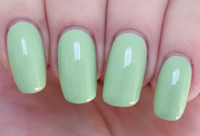
Mount Wutai was released by Minnesota-based indie polish maker Elevation Polish as part of the Woke Up in China collection in July 2015. This is officially described as a "spring jade creme," which seems perfect to me. It's a spring green tint of white, with a delicious milky aspect that makes it a great match for Anchor Hocking's popular Fire King Jadeite glass tableware. On the nail, it is irresistibly fresh with just the right amount of yellow in there to give it a little zap of energy. It reminds me of honeydew melon.

Application was a little tense. The consistency of Mount Wutai is fluid, creamy and dense with a medium-to-thicker viscosity and a smooth, if uneven, glide over the nail. Self-leveling properties were ok, but slow. I had a hard time figuring out how best to apply this polish -- unevenness and slow leveling made me want to use thicker coats, which turned out to be not such a great approach. It did an excellent job of camouflaging my nail ridges, though. *lol* Next time I'll use the thinnest coats I can manage, allow plenty of dry time in between and ignore the streaks. Inevitably they take care of themselves. Pigmentation is very good but streaky, as I mentioned, in the way that many white-based polishes are, and I ended up using three coats for this manicure. Cleanup was easy. Mount Wutai dries naturally in fairly good time to a beautiful glossy finish. Small favors -- take 'em where you can! 

Photos show three coats of Mount Wutai over Pretty Serious Rock On treatment and Pretty Serious All Your Base basecoat with a topcoat of Seche Vite. 


Elevation Polish Mount Wutai


Elevation Polish Mount Wutai


Elevation Polish Mount Wutai


Elevation Polish Mount Wutai


Elevation Polish Mount Wutai


Elevation Polish Mount Wutai


Elevation Polish Mount Wutai


Elevation Polish Mount Wutai


Elevation Polish Mount Wutai


Elevation Polish Mount Wutai

My late aunt used to have a magnificent jade ring with a huge, highly polished elliptical cabochon that was similar in color to this polish but brighter. I only saw her wear it once, to dinner at a small restaurant in Chinatown during a trip my family took to NYC to see A Chorus Line, but I'll never forget the luminous beauty of that stone. I remember watching it as she flipped back her long platinum blond hair and extended a graceful hand to the owner of the restaurant, a very large man with a Cheshire Cat grin who knew her well and came out to our table to greet us. I didn't even realize at that moment that I was vowing to myself that I wanted to be just like her when I grew up -- not the only time I ever had that thought! 

Despite my issues with application, I adore this fresh pale green. It's unequivocal and pleasingly piquant for a pastel. I think it's probably better served by a richer skintone than mine and it does make my fingers look red, but the color really hits the spot!

love,
Liz