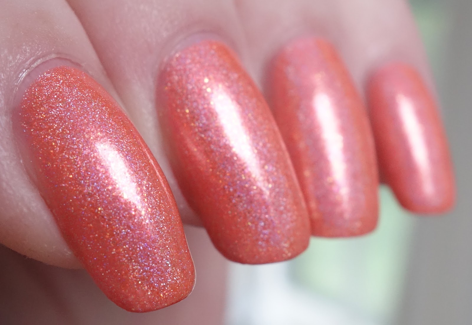
Girly Bits No Tan Lines
No Tan Lines was released last month by Canadian indie polish maker Girly Bits as one-half of the limited edition July 2016 Color of the Month Duo. Creator Pam descibes this as a "medium orange coral low-medium density holo with red shimmer and gold glass fleck." It's a light rosy tangerine color, not a pastel but sharing that desaturated kind of feel, something along the lines of a desaturated coral or tea rose. Abundant red shimmers read as rose within the base, accounting for the rosy hue and creating a prominent on-tone semi-metallic underlay that produces a bright flash as light travels over the polish. Holographic pigment generates nuanced shades of melon and pale pink with a faint violet heart, and beautiful golden glass flecks gleam brightly throughout.
Application was most agreeable! The consistency of No Tan Lines is fluid, full-bodied and smooth with a medium-to-thicker viscosity that I added polish thinner to at the outset. Thinned, it has an easy, self-leveling flow over the nail that is amenable to thin or thicker coats and a pleasure to work with. Pigmentation is very good. Wearably opaque coverage can be had in two medium coats with a hint of visible nail line and I added third for the photos, which deepened the color slightly. Cleanup is mostly about those sticky glass fleck shimmers. No Tan Lines dries in very good time to a smooth, shiny finish. Topcoat does not interfere with the holographic properties of the polish in any way.
Photos show three coats of No Tan Lines over treatment and basecoat with a topcoat of Seche Vite.
 |
| Girly Bits No Tan Lines |
 |
| Girly Bits No Tan Lines |
 |
| Girly Bits No Tan Lines |
 |
| Girly Bits No Tan Lines |
 |
| Girly Bits No Tan Lines |
 |
| Girly Bits No Tan Lines |
 |
| Girly Bits No Tan Lines |
 |
| Girly Bits No Tan Lines |
 |
| Girly Bits No Tan Lines |
 |
| Girly Bits No Tan Lines |
 |
| Girly Bits No Tan Lines |
The gleaming semi-metallic aspect of this polish is more conspicuous in person, especially in low light. We're overcast (and SO HUMID -- all the downstairs windows are rimmed with condensation) here today, so I haven't had a chance to see this in direct sun but judging by the holographic effects in ambient light, I'm thinking the prismatic display will be a bit stronger than the low-medium density description would lead you to expect.
This has a delicate, uber-feminine look that I think would be at its best against warmer skin tones than mine. It would look wonderful against tan skin! Anyone who loves peach will probably love this color as well.
ttyl,
Liz


I love it; it's super pretty :)
ReplyDeleteI agree! The color is beautifully engineered -- You don't often see this kind of delicate melony coral done so well, and the finish is silky sleek. So money!
DeleteWhat is it about these coral-y, tangerine-y, melon-y polishes that is SO endearing. And then add in holo - wow! I just want to make a pet of it! So beautiful, Liz. Like you, this would not compliment my skin tone that much but I wear these tones anyway - they are just so darn cute.
ReplyDeleteI thought you might like this one, Lara! With your love of pastels, I'd imagined your complexion warm-toned and golden, which I think would make this polish really sing. DENIED! Oh well, I still love you. *lol*
DeleteThis kind of coral/peach shade is super feminine and fresh. When I wore it, I kept thinking of the mother of a childhood friend, a tall thin blond who would be tanning in her back yard while we played with our Breyer model horses on the other side of the sliding glass doors. She was a country club queen!
This is surely one of the most perfect peach polishes I've ever seen; it should be forbidden for such beautiful polished to be LE :) I have to disagree on one point, I really think this looks gorgeous with your porcelain skin! I was originally planning to paint the kitchen a peachy pink peony color a little lighter than this, but then I found willow green/spa blue/ taupe/dove gray glass/stone chevron tile on clearance for the backsplash, and the rest is history. I do love peach though so I'll have to find a place for it in the house somewhere. Peach scents and flavors are also some of my favorites; sweet and happy!!
ReplyDeleteThis photogenic beauty has a look that is more semi-metallic than my photos show -- that underlay created by the shimmers and glass flecks is actually quite prominent, the holographic effects kind of hover over it. Thank you, my dear, for your kind words but I'm still not convinced about my compatibility with peach. It feels muddy against my pinkage and very much like it belongs on a warmer complected individual.
DeleteThis summer has been absolutely splendid for peaches, no? They've been so sweet and delicious! I've been making fresh peach-based smoothies every morning with my protien mix, skim milk and berries from my stashes in the freezer, peach and blueberry, peach and blackberry, peach and raspberry -- so good!
I love contemplating paint colors! That tile palette sounds DIVINE! I'd think that a nice full-bodied peach would make a wonderful bedroom color, especially if it is becoming to you. If the room gets a lot of sun, make sure it is strong enough to stay peach in bright light!